5 Graph Representations of Word Cooccurences
Word collocations and co-occurrences as explained in Chapter 4 reveal certain dimensions of relations between words. The process allows us to capture and analyze the appearances of words together. This allows linguists to understand what the meanings of the existence of these words are together, from a general linguistic point of view as well as from grammatical perspectives. This is the simplest and most basic method of analyzing word relations (i.e., through collocations and co-occurrences).
Stylistically expressive elements in a text can be identified at the word-level (lexical), in the way sentences are structured (syntactic), and by analyzing the attributes of the core meaning that is conveyed (semantic) (DiMarco and Hirst 1988). An example of lexical elements is the choice of words between synonyms, e.g. “residence” versus “home”. An example of syntactic elements is sentence compounding, e.g. “We have never been to Asia, nor have we visited Africa”, where a coordinating conjunction is required for two independent clauses to relate. An example of semantic elements in style and expression, is “John attended Oxford, which is the best university in the UK” versus “Oxford, the best university in the UK attended by John”. In the first sentence, the emphasis is on John, while the second emphasizes Oxford.
At the fundamental level, all three elements involve the “positioning” of words in a sentence and how they fit into the style and purpose of the texts in question. Comprehensive linguistic studies require a deep look into the three elements within the texts of the whole corpus to determine differences in styles, methods, and expositions of the authors.
In the case of Al-Quran, we have the original Arabic text, which is fixed and unchangeable. We have various translations of the Quran into other languages, of which the sample English translations of Saheeh and Yusuf Ali are of particular interest in this book. Since a comprehensive analysis requires knowledge and expertise of linguistics, of which neither of us is an expert, our focus is on exhibiting and highlighting the possible issues in general without adhering to any linguistic or language rules. This is what we term as a “non-parametric” approach that we alluded to in the introduction of the book.
This chapter is divided into three main parts. In the first part, we deal with statistical properties of the word positions and perform comparisons between the Arabic text (Quran Arabic) and the English translations (Saheeh and Yusuf Ali). This is the straightforward way of dealing with the statistical properties of word relations. In the second part, we will take a different approach in dealing with the same issue, by converting the data into a network graph structure, using Surah Yusuf as our sample. Finally, in the third part, we will provide a short tutorial on igraph and ggraph packages in R and use Surah Yusuf as a working example for various network analyses which are useful for the coming chapters of the book.
5.1 Statistical analysis of word positions
Grammatical and syntactical positions or POS tags within a corpus show the usage of grammar styles in the writing of the author. Since the original source of the text is Al-Quran Arabic, upon which all translations are based, one way to observe the differences in the styles is by comparing the statistical properties of these POS tags between the corpora. The properties of these tags may reveal differences in style and approach of the texts, as explained earlier.
We will do the analysis based on Saheeh, Yusuf Ali and we will use the Quran Arabic as benchmark comparisons whenever required.61 First, we create a data.frame for the entire Saheeh corpus udpipe annotation for the English language model (named QSI_udp for Saheeh and QYA_udp for Yusuf Ali). Then we also create udpipe annotation for the Arabic language model (named QAR_udp for Quran Arabic text without diacritics (from quran_ar_min of quRan package))62.
5.1.1 Comparison between Saheeh and Yusuf Ali
One simple and basic analysis is to observe the percentages of UPOS across segments of texts, such as chapters, and in our case Surahs, within a corpus (Saheeh or Yusuf Ali) and compare with another corpus (Saheeh vs Yusuf Ali).
early_surah_no = c("2","3","4","5","6")
mid_surah_no = c("56","57","58","59","60")
last_surah_no = c("107","108","109","110","111","112","113","114")
pos_plotter = function(df_udp, surah_no_input,title_label){
  df_udp %>% filter(surah_no %in% surah_no_input) %>%
                group_by(surah_no) %>% count(upos) %>%
                mutate(prop=n/sum(n)) %>%
                ggplot(aes(x = as.factor(upos), y=prop, color = surah_no)) +
                  geom_point() + scale_color_brewer(palette = "Dark2") +
                  theme(axis.text.x = element_text(angle = 90),
                        legend.position = "top") +
                  ylim(0,0.35) +
                  labs(title = title_label,
                     x = "UPOS", y = "Percentage")+
    theme(plot.background = element_rect(color = "black"))+
    scale_y_continuous(labels = scales::percent)

}
First, let us plot the POS percentages for the entire text.
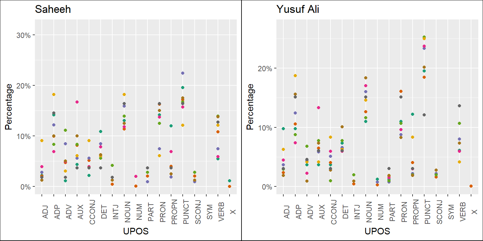
Figure 5.1: Percentage of POS categories in Saheeh and Yusuf Ali for the entire text
From Figure 5.1, we can see that both Saheeh and Yusuf Ali prominently use nouns, pronouns, verbs, and adpositions almost similarly (based on the observation for the texts, the full sample size). However, in the case of punctuation, Yusuf Ali tends to be higher than Saheeh. As indicated by linguists, usage of more punctuation indicates the possible difference between the literary English of Yusuf Ali compared to Saheeh (possibly due to the American English of Saheeh).
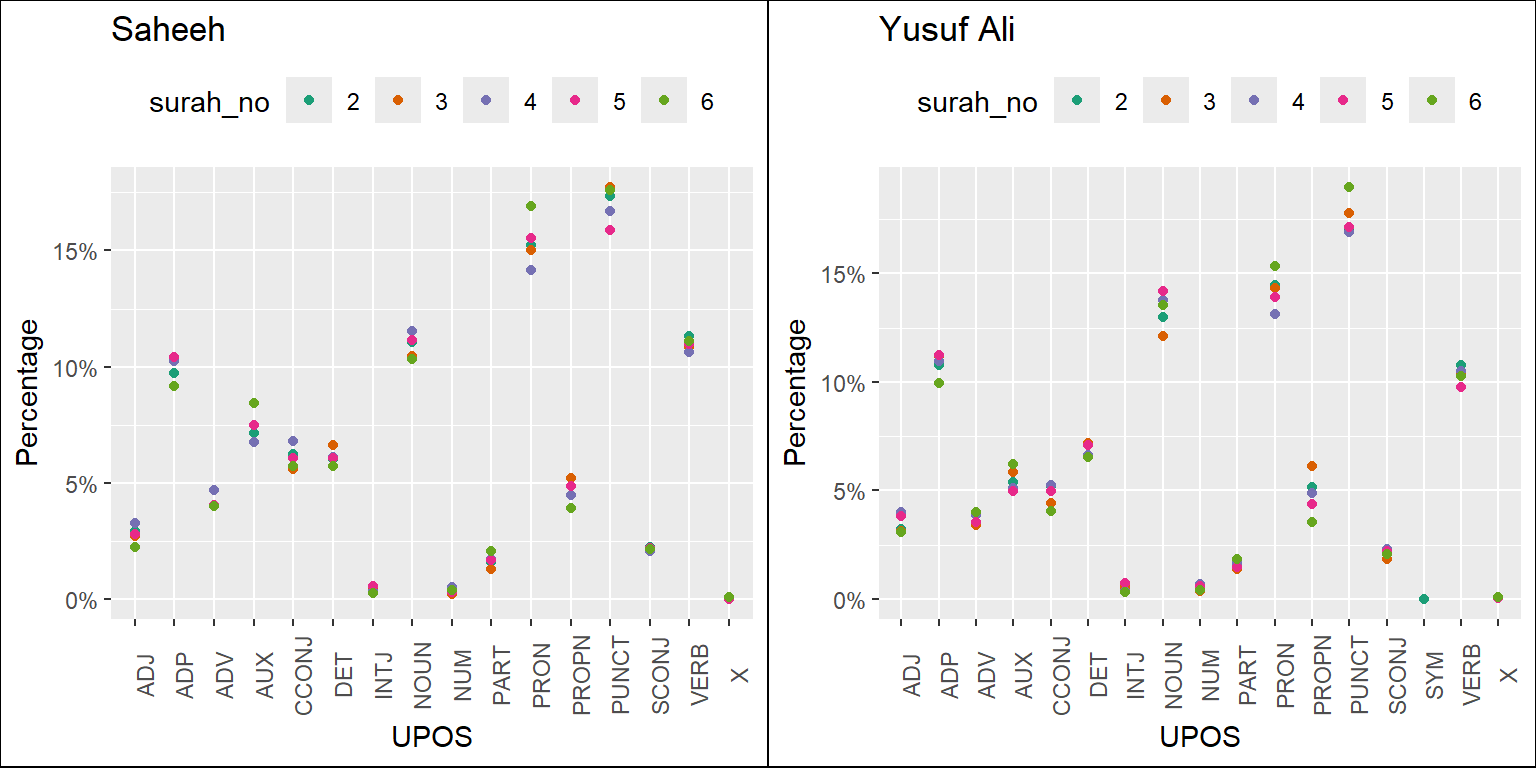
Figure 5.2: Percentage of POS categories in Saheeh and Yusuf Ali for early Surahs
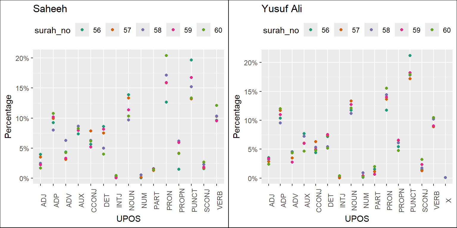
Figure 5.3: Percentage of POS categories in Saheeh and Yusuf Ali for middle Surahs
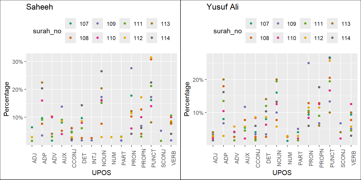
Figure 5.4: Percentage of POS in Saheeh and Yusuf Ali for last Surahs
The plots resulting from the codes are in Figure 5.2, Figure 5.3, and Figure 5.4. They refer to the long Surahs, medium Surahs, and short Surahs (the last few). We will make some observations based on just visualizing the plots.
In general, we can conclude that, based on the statistics of POS tags, Saheeh and Yusuf Ali differ to some degree from a lexical perspective. A clear trend emerges where, as the Surahs become shorter, the compositions of upos tags vary with higher variability. This re-confirms our earlier observations from Figure 2.13 in Chapter 2, which shows that the lexical variety increases as the Surah becomes shorter.
Furthermore, the lexical differences between the translations may extend into the semantics as well the pragmatics, which indicate differences in meaning or interpretation. Again, this is a non-trivial issue, since over the years many attempts to produce reliable interpretations of Al-Quran have been attempted by many scholars. They need to be re-looked upon since it may seriously affect the teaching of Al-Quran using interpretations based upon non-Quranic native languages.
5.1.2 Comparison against the Arabic text
We will compare the POS taggings with the Arabic text, for the purpose of benchmarking. It is not our intention to do a comprehensive analysis of the texts, as it is beyond the scope of the current book. We have planned it for our future research. However, we believe that if we want to compare the works of translations, a benchmark is required, and there is no better choice than the original Arabic text itself.
First,we need to load the Arabic POS tagging data63 into the environment and then we can make the comparisons.
We first tabulate the data in numbers for a quick overview.
| Arabic | Saheeh | Yusuf Ali | |
|---|---|---|---|
| PUNCTUATION | 18,157 | 33,960 | 39,315 |
| NOUN | 40,093 | 21,754 | 26,251 |
| PRONOUN | 29,940 | 29,986 | 29,612 |
| VERB | 31,337 | 20,723 | 21,305 |
| X | 34,701 | 55 | 66 |
| ADPOSITION | 30,721 | 18,614 | 21,722 |
| —————– | ——— | ——— | ———— |
| Total tokens | 67,161 | 113,370 | 117,415 |
| Unique tokens | 16,208 | 5,739 | 7,484 |
Yusuf Ali is consistently higher than Saheeh in most categories: punctuation, nouns, pronouns, verbs, and adpositions. If we benchmark the English translations against the Arabic, we can see that both use fewer nouns and pronouns combined. Even the verbs are greater in Arabic compared to the English translations.
Clearly, the English translation (represented by Saheeh and Yusuf Ali) is starkly different compared to the Arabic when it comes to the lexical composition (which is probably obvious, due to the difference between English and Arabic). However, is the difference due to the efforts of translating compact Arabic texts to English, or is it due to the compactness of meaning? The first difference is purely a question of lexical styles, whilst the second one is a question of semantics and pragmatics of the language and texts. The answer to this question is non-trivial and requires deeper research.
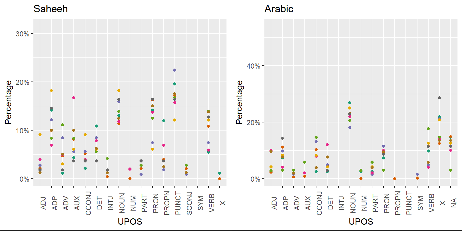
Figure 5.5: Percentage of POS categories in Saheeh and Arabic for the entire text
Based on the analysis here, we can provide some suggestions, which are evident (visually) through the plots of the statistics of the POS tags as presented in Figure 5.5. For this purpose, we made some comparisons between Saheeh and Arabic (we left out Yusuf Ali for brevity) and included comparisons for the various Surahs’ groupings in Figure 5.6, Figure 5.7, and Figure 5.8 for the readers to make some sense out of it.
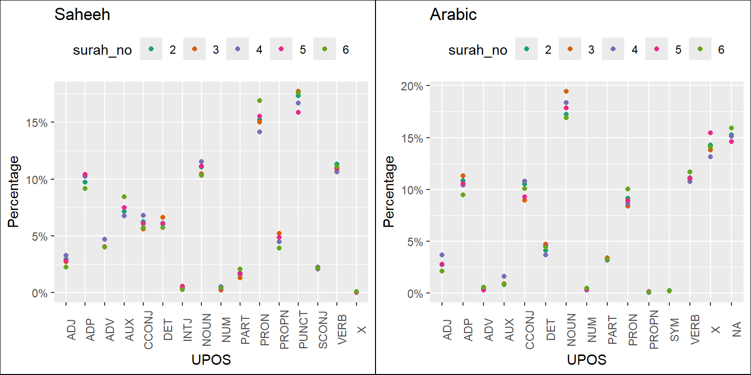
Figure 5.6: Percentage of POS categories in Saheeh and Arabic for the early Surahs
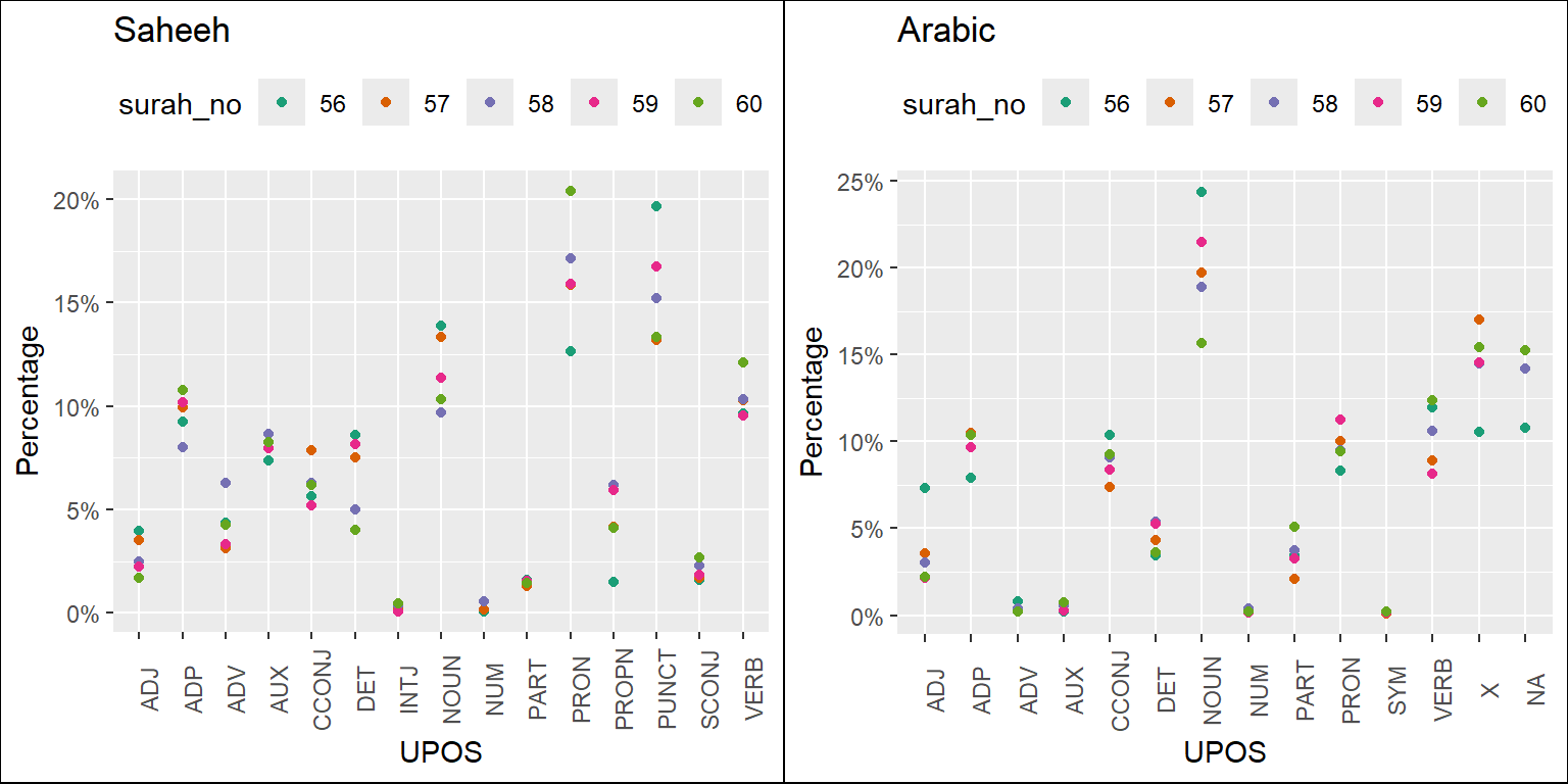
Figure 5.7: Percentage of POS categories in Saheeh and Arabic for the middle Surahs
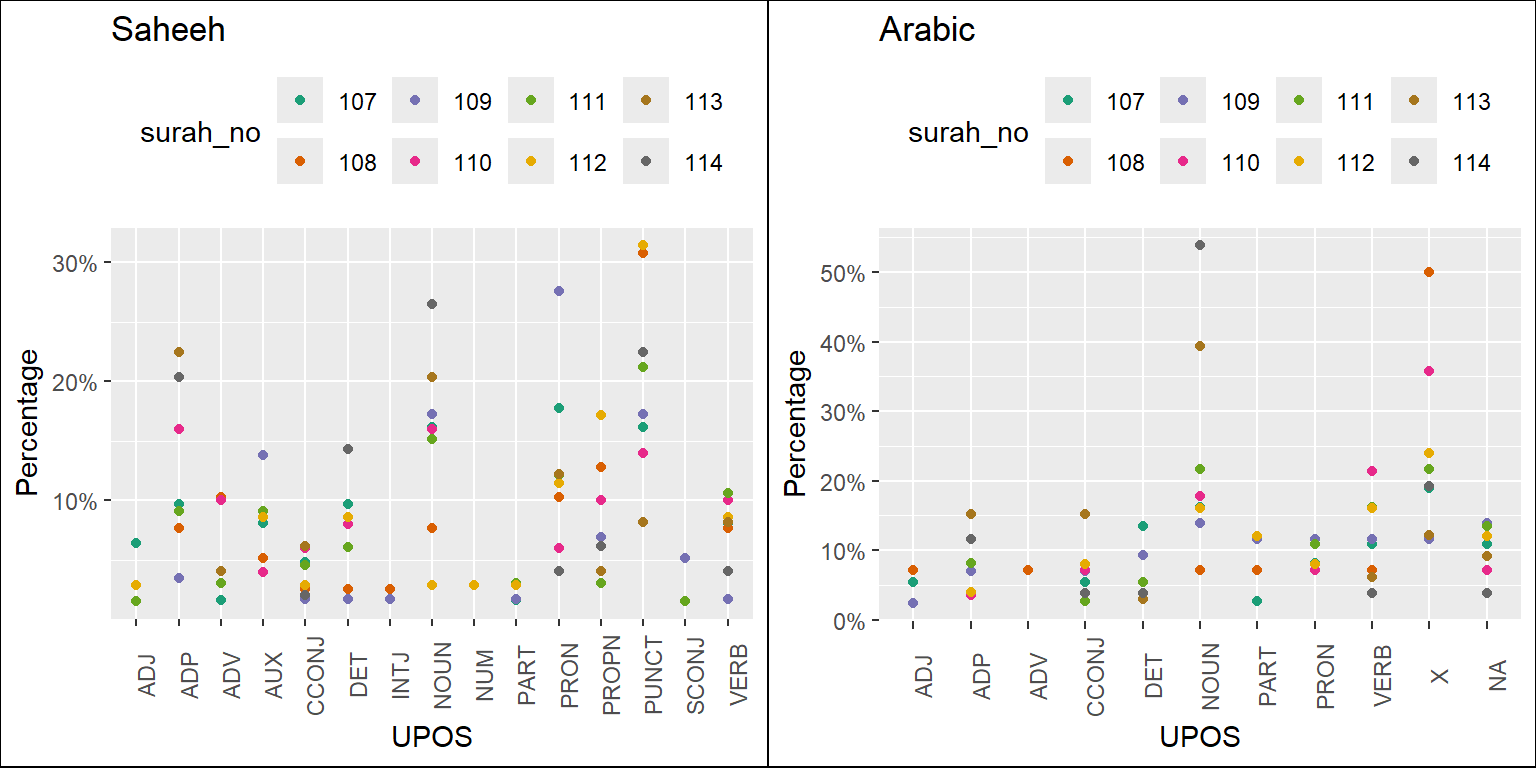
Figure 5.8: Percentage of POS categories in Saheeh and Arabic for the last Surahs
Finally, we leave with the following question: what do all these meant when translating the Quranic Arabic to the English language (and other languages for that matter)? At least we may say so from the semantic styles point of view, as indicated by many Islamic scholars that Al-Quran has a special language (Saeh 2015). But is it also true for lexical and syntactic styles? Furthermore, does the semantic richness of the Arabic used in Al-Quran, together with the lexical and syntactic richness combined, result in texts which produce higher-level meanings, implying that to learn Al-Quran, one must rely only on the original Arabic text?
General comparisons as provided in this section open more questions than answers. This is exactly the purpose of our book, to ask questions from the exploratory findings, from which we suggest other research topics.
5.2 Focus on Surah Yusuf
Now we will explore in more detail the observations made in the previous section, applied to a specific Surah, Surah Yusuf. The choice of Surah Yusuf is made consciously with the knowledge that the Surah contains one major story, namely that of Prophet Yusuf (Joseph).
We will start by plotting the POS tags statistics for the Surah Yusuf from Saheeh and Yusuf Ali.
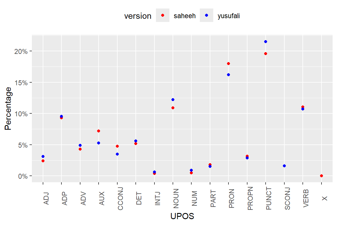
Figure 5.9: Percentage of POS categories in Surah Yusuf
As evident from Figure 5.9, the differences in lexical styles between Saheeh and Yusuf Ali are not that obvious, except for the fact that Yusuf Ali used more punctuations, which is the same observation made for the entire Quran (as in Figure 5.1).
Now we will start to compute the co-occurrences in Surah Yusuf for the Saheeh and Yusuf Ali.
sy_si = QSI_udp %>% filter(surah_no %in% "12")
sy_ya = QYA_udp %>% filter(surah_no %in% "12")
QSI_cooc <- cooccurrence(x = subset(sy_si, upos %in% c("NOUN", "PROPN", "VERB")),
                     term = "lemma",
                     group = c("ayah_no", "paragraph_id", "sentence_id"))
QYA_cooc <- cooccurrence(x = subset(sy_ya, upos %in% c("NOUN", "PROPN", "VERB")),
                     term = "lemma",
                     group = c("ayah_no", "paragraph_id", "sentence_id"))
We then create a graph from the data.frame as an igraph graph object, which we can visualize as a graph object using ggraph.
QSI_cooc_g <- graph_from_data_frame(head(QSI_cooc,100))
QYA_cooc_g <- graph_from_data_frame(head(QYA_cooc,100))
gg_plotter1 = function(grf_plot){
  ggraph(grf_plot, layout = "fr") +
  geom_edge_link(aes(width = cooc, edge_alpha = cooc),
                 edge_colour = "deeppink") +
  geom_node_point(aes(size = igraph::degree(grf_plot)), shape = 1,
                  color = "black") +
  geom_node_text(aes(label = name), col = "darkblue", size = 3)
}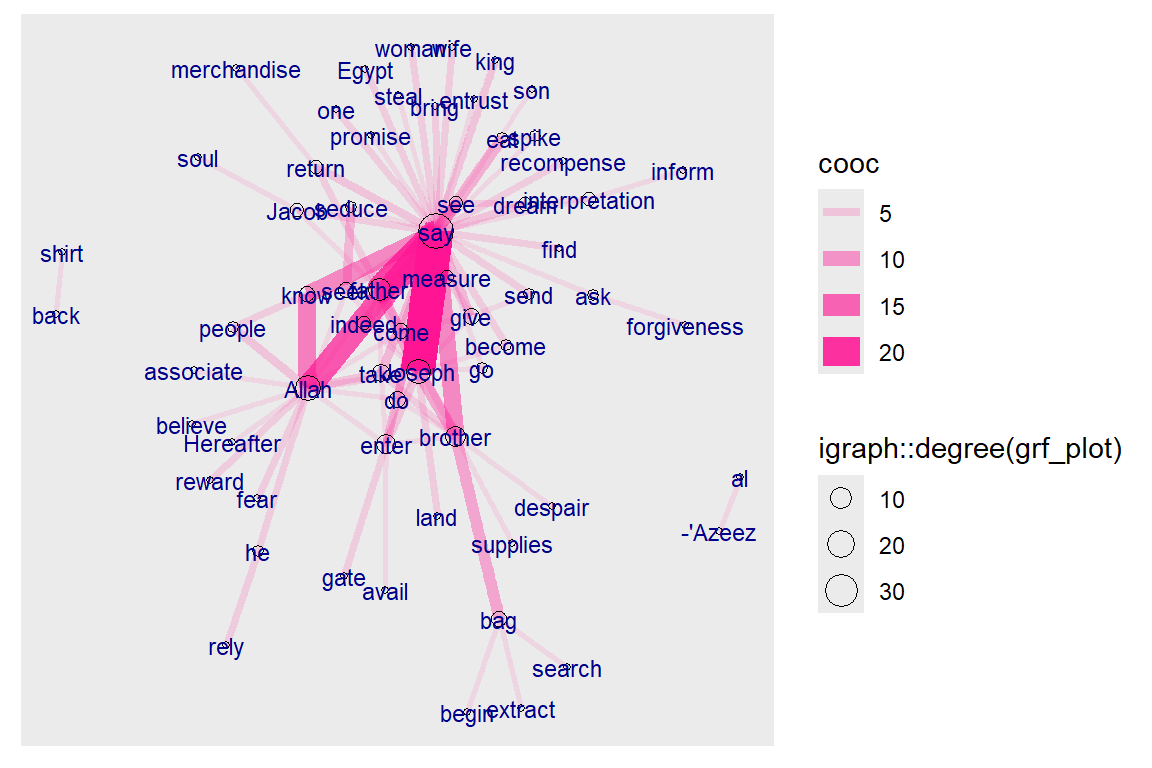
Figure 5.10: Co-occurrence network for top relations in Surah Yusuf for Saheeh
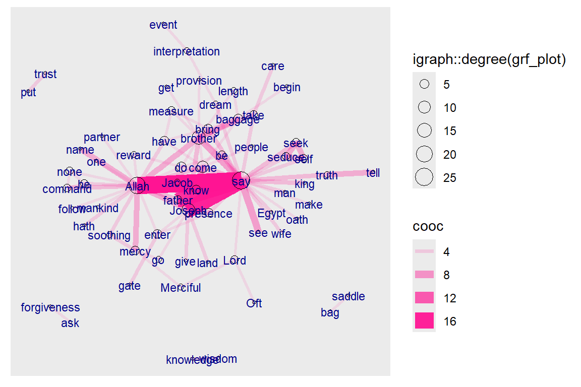
Figure 5.11: Co-occurrence network for top relations in Surah Yusuf for Yusuf Ali
The plots in Figure 5.10 and Figure 5.11 are networks of words that co-occur frequently within Surah Yusuf. The nodes (the words), which are sized to their frequency of appearances, are linked by the edges, which are sized to the number of times the co-occurrence occurs. Clearly in the Saheeh and Yusuf Ali version, “say”, “Allah” and “Joseph” are higher by both counts. This is similar to the bigrams we did earlier with one major difference: we tag the words in accordance to its dependency parser and no stopwords are removed from the texts.64
5.2.1 Arc method of visualization
Graphs, in the sense of graph theory, represent a powerful mathematical concept as well as a beautiful way of visualizing data. Here we present a few different ways of presenting the same data but using different layouts.
ggraph(QSI_cooc_g, layout = 'linear') +
    geom_edge_arc(color = "gold3", width=0.5) +
    geom_node_point(size=2, color="black") +
    geom_node_text(aes(label = name), repel=TRUE, size = 4) +
    theme_void()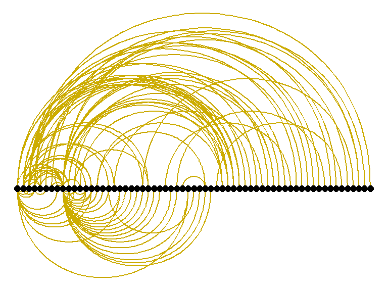
Figure 5.12: Arc view of co-occurrence network for top relations in Surah Yusuf for Saheeh
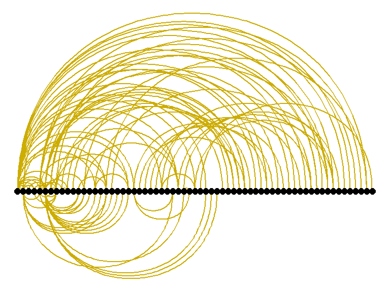
Figure 5.13: Arc view of co-occurrence network for top relations in Surah Yusuf for Yusuf Ali
Figure 5.12 and Figure 5.13, are “arc” layouts, which organize the links in a “conversational” manner. We can observe that Saheeh’s groupings of relations differ from Yusuf Ali’s (from the organization of the arcs). The question is which one is nearer to the original texts (as shown in Figure 5.14). We let the readers make their own judgment!
What we want to show is there are many tools besides pure statistical analysis to see the lexical styles of texts, and possibly the semantic styles, by just observations through visualizations.
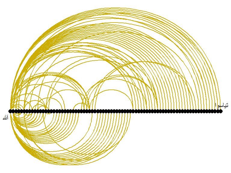
Figure 5.14: Arc view of co-occurrence network for top relations in Surah Yusuf for Arabic
5.2.2 Circular method of visualization
ggraph(QSI_cooc_g, layout = 'linear', circular = TRUE) +
     geom_edge_arc(color = "gold3", width=0.5) +
     geom_node_point(aes(size = degree(QSI_cooc_g)),
                     alpha = igraph::degree(QSI_cooc_g),
                     colour = "#a83268") +
     geom_node_text(aes(label = name), size = 3, repel=TRUE) +
     theme_void()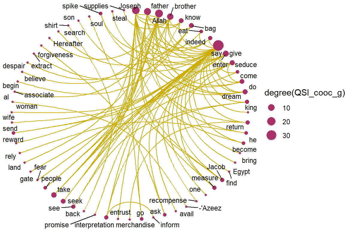
Figure 5.15: Circular view of co-occurrence network for top relations in Surah Yusuf for Saheeh
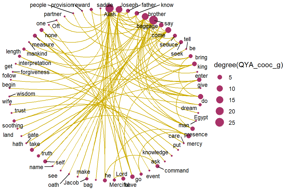
Figure 5.16: Circular view of co-occurrence network for top relations in Surah Yusuf for Yusuf Ali
Figure 5.15 and Figure 5.16, are circular layouts that provide another perspective of viewing, like a round-table discussion. Do the two “round tables” (Saheeh versus Yusuf Ali) look the same? We can say that they are close, but not the same. This is an example of the subtle differences in the “semantic meaning” (and may also be pragmatic meaning) of the texts.
For benchmarking, let us just compare both to the Arabic version in Figure 5.17 and we let the readers make their own judgment.
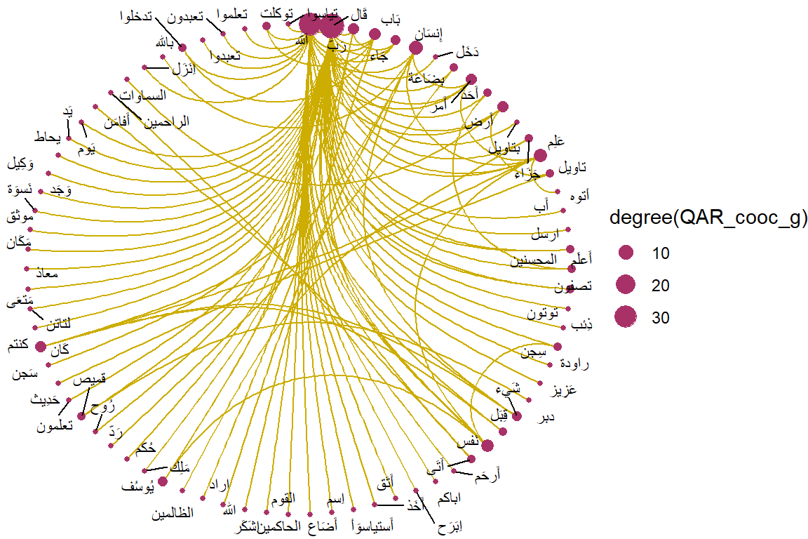
Figure 5.17: Circular view of co-occurrence network for top relations in Surah Yusuf for Arabic texts
5.2.3 Grouping of co-occurences
Next, we can ask, do these words which co-occur highly have their groupings? We know offhand that there are few nodes (words) that will have links to many other words, but we want to see whether all these “smaller” nodes (words of lesser prominence) are grouped in a certain manner.
This is easily visualized through graph clustering algorithms. We will show two different methods of “graph clustering”, one is based on the fastgreedy algorithm.
fc1 <- fastgreedy.community(simplify(as.undirected(QSI_cooc_g)))
set.seed(1234)
plot(QSI_cooc_g, vertex.color=vertex_attr(QSI_cooc_g)$cor,
      vertex.size = degree(QSI_cooc_g),
      vertex.label=NA,
      edge.width = NA,
      edge.color = NA,
      layout = layout_with_kk,
      mark.groups = fc1,
      mark.border=NA)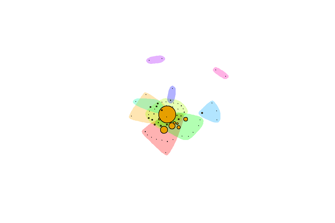
Figure 5.18: Groupings by fastgreedy in Surah Yusuf for Saheeh
fc2 <- fastgreedy.community(simplify(as.undirected(QYA_cooc_g)))
set.seed(2345)
plot(QYA_cooc_g, vertex.color=vertex_attr(QYA_cooc_g)$cor,
      vertex.size = degree(QYA_cooc_g),
      vertex.label=NA,
      edge.width = NA,
      edge.color = NA,
      layout = layout_with_kk,
      mark.groups = fc2,
      mark.border=NA)
Figure 5.19: Groupings by fastgreedy in Surah Yusuf for Yusuf Ali
Figure 5.18 and Figure 5.19 show the groupings by the colors. To interpret these visuals, we use the analogy of people in a large ballroom having conversations or hearing conversations. Are there any groupings between the people (denoted by the color schemes)? The larger nodes represent people who speak more than the smaller nodes, and a set of colors represent the sub-groupings of people. Based on this analogy, we can see that Saheeh differs from Yusuf Ali to some degree. What this implies is that the differences between Saheeh and Yusuf Ali are beyond lexical, syntactic, and semantic, rather it goes towards pragmatic (i.e. dynamics of conversations) as well.
There are so many ways to show these dynamics using graph theory mathematics, but for now, it suffices to leave the readers with visual impressions. For this reason, in the next section, we present a short tutorial on graphs in R. We want the readers to use some of the methods of graphing and learn to see many other dimensions of the relations using graph algorithms.
5.3 A short tutorial on graphs in R
In this section, we will detour from our main discussion to provide a brief tutorial for graph packages in R. We will use the data from Surah Yusuf that we worked on earlier as a sample. This serves both purposes of showing how we can use R for analysis using network graphs, and at the same time demonstrate various possibilities of analysis using graph packages in R.
We will start with the data. As explained in the previous chapter, word co-occurrences allow us to see how words are used either in the same sentence or next to each other. The udpipe package makes creating co-occurrence graphs using the relevant POS tags easy. We look at how many times nouns, proper nouns, adjectives, verbs, adverbs, and numbers are used in the same verse.
cooccur <- cooccurrence(x = subset(x,upos %in% c("NOUN", "PROPN", "VERB",
                                                "ADJ", "ADV", "NUM")),
                        term = "lemma",
                        group = c("doc_id", "paragraph_id", "sentence_id"))
The result can be easily visualized using the igraph and ggraph R packages as we have seen earlier.
library(igraph)
library(ggraph)
library(ggplot2)
wordnetwork <- head(cooccur, 100)
wordnetwork <- graph_from_data_frame(wordnetwork)
ggraph(wordnetwork, layout = "fr") +
  geom_edge_link(aes(width = cooc, edge_alpha = cooc), edge_colour = "#ed9de9") +
  geom_node_point(aes(size = igraph::degree(wordnetwork)), shape = 1,
                  color = "black") +
  geom_node_text(aes(label = name), col = "darkblue", size = 3) +
  labs(title = "Co-occurrences within sentence",
       subtitle = "Top 100 Nouns, Names, Adjectives, Verbs, Adverbs",
       caption = "Surah Yusuf (Sahih International)")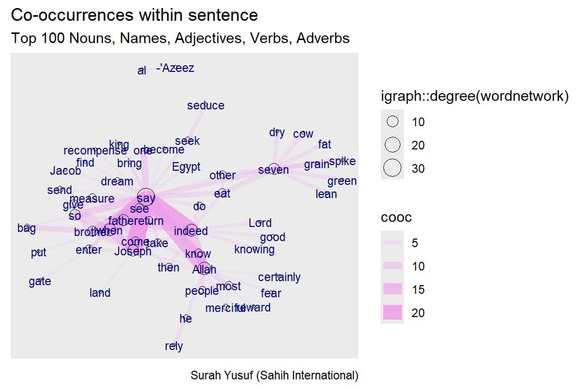
Figure 5.20: Co-occurence within sentence
The network graph shows the main words used in the Surah as nodes. The nouns and proper nouns like Joseph, his father, his brothers, the king, and the wife of the minister (al-’Azeez) make up the main characters in this revealed story. The strength or influence of each word (node) is visualized by the size of the circle representing the words (nodes) and the thickness of the links with other nodes. The verb “say” is a node that dominates since Surah Yusuf is a narrated story. It is interesting to see the strong link and occurrence of “know” with “Allah”.
After the simple introduction and sample examples, we come back to the graph model of how many times nouns, proper nouns, adjectives, verbs, adverbs, and numbers are used in the same verse in Surah Yusuf (111 verses).
5.3.1 Graph creation
Data, format, size The example data used here is not big, many of the ideas behind the visualizations we will generate apply to medium and large-scale networks.
- When drawing very big networks we focus on identifying and visualizing communities or subsets of nodes.
- Visualizing larger networks as giant hairballs is less helpful than providing plots that show key characteristics of the graph.
Create graph
- Read nodes (term1 and term2) and edges
- Convert raw data to an igraph network object.
- Use the graph_from_data_frame() function, which takes one data frame (in our case)
- Its first two columns are the IDs of the source and the target node for each edge.
- The following columns are edge attributes (cooc, or the number of co-occurrences).
- Nodes start with a column of node IDs.
- Any following columns are interpreted as node attributes.
We purposely limited the graph to 50 co-occurrences (links/edges) to make the plots easy to visualize. R is case sensitive. The choice of Weight/weight or Type/type makes a great difference.
- The description of an igraph object starts with four letters:
- D or U, for a directed or undirected graph
- N for a named graph (where nodes have a name attribute)
- W for a weighted graph (where edges have a weight attribute)
- B for a bipartite (two-mode) graph (where nodes have a type attribute)
- The two numbers that follow (35 50) refer to the number of nodes and edges in the graph. The description also lists node and edge attributes, for example:
- (g/c) - graph-level character attribute
- (v/c) - vertex-level character attribute
- (e/n) - edge-level numeric attribute
Some simple commands
- We have easy access to nodes, edges, and their attributes with:
# Sample of Edges of the network
E(gm)[1:3]
E(gm)[4:6]
# Sample of Vertices of the network
V(gm)[1:4]
V(gm)[5:8]
# Sample of Edge attribute
E(gm)$cooc[1:15]
# Sample of Vertex attribute
V(gm)$name[1:4]
V(gm)$name[5:8]
Find nodes and edges by attribute:
- We can select nodes and edges based on their attributes.
5.3.2 Graph plots
We have created a scaled down network of only 50 edges from the Surah Yusuf word co-occurrence network. We refer to our tutorial word network as gm. Let us make a first simple plot and then improve it in steps. We adapted these from https://kateto.net/network-visualization.65
Using igraph plots
- There are sufficient plotting functions in igraph to begin with.
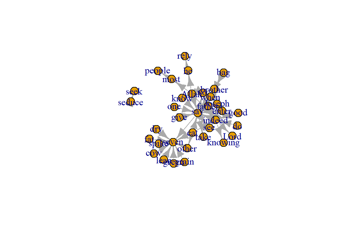
Figure 5.21: First plot of tutorial word network
Plot output is in Figure 5.21.
Plotting parameters
Figure 5.21 is not a pretty picture! The network plots in igraph have a wide set of parameters we can set. These include node options (starting with vertex) and edge options (starting with edge). A list of selected options is included below, but we can also check out by typing ?igraph.plotting at the console prompt for more information.
- For the nodes, the command is with vertex.xxxx, where xxxx are options, such as color, label, etc.
- For the edges, the command is with edge.xxxx, where yyyy are options, such as color, label, etc.
- Other commands are margin, frame, palette, resalce, etc.
Plot with curved edges (edge.curved=.1) and reduce arrow size:
- We can set the node and edge options in two ways.
- first one is to specify them in the plot() function, as we do below.
- Note that using curved edges will allow you to see multiple links between two nodes (e.g. links going in either direction or multiplex links)
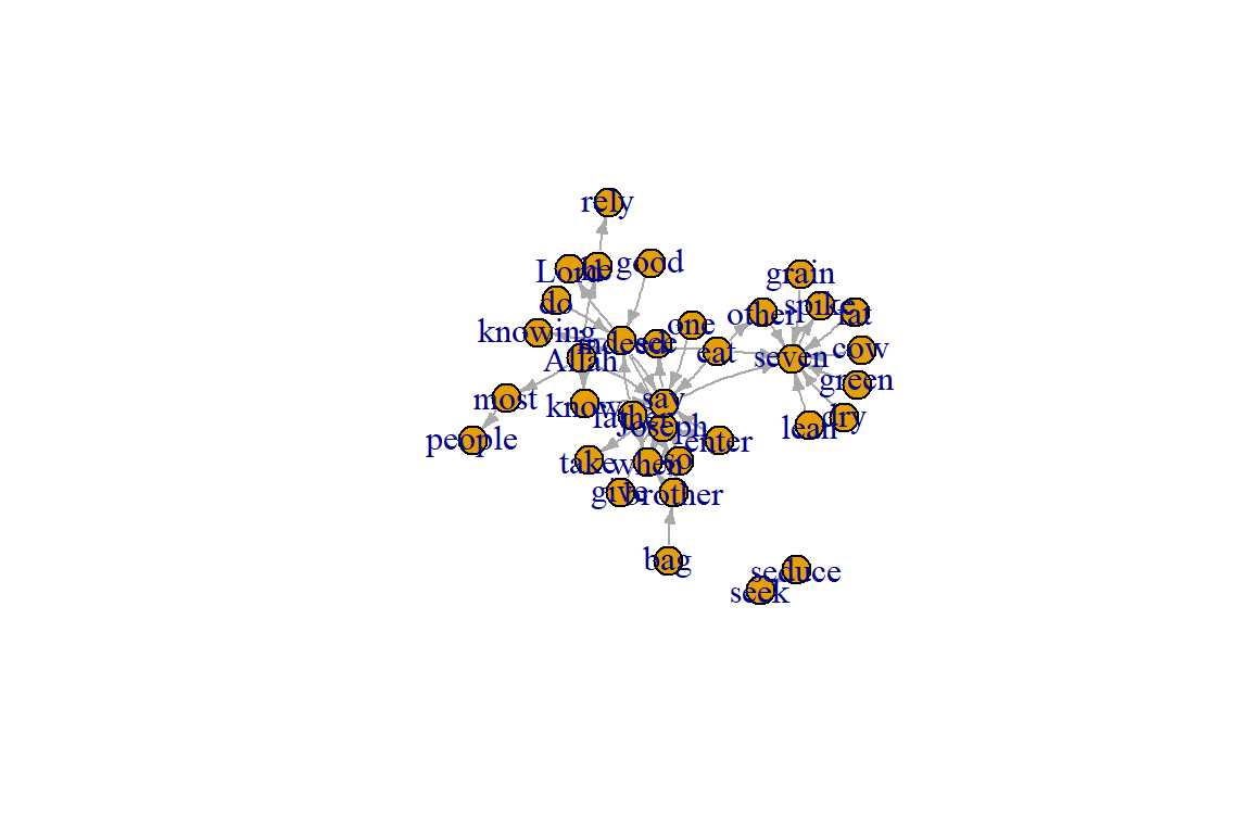
Figure 5.22: Adjust some edge parameters
Plot output is in Figure 5.22.
Set edge color to red, the node color to yellow:
- We can set colors by name or hex code.
- Replace the vertex label with the node names stored in “Label”
plot(gm, edge.arrow.size=.2, edge.color="red",
      vertex.color="yellow", vertex.frame.color="#ffffff",
      vertex.label=V(gm)$Label, vertex.label.color="black")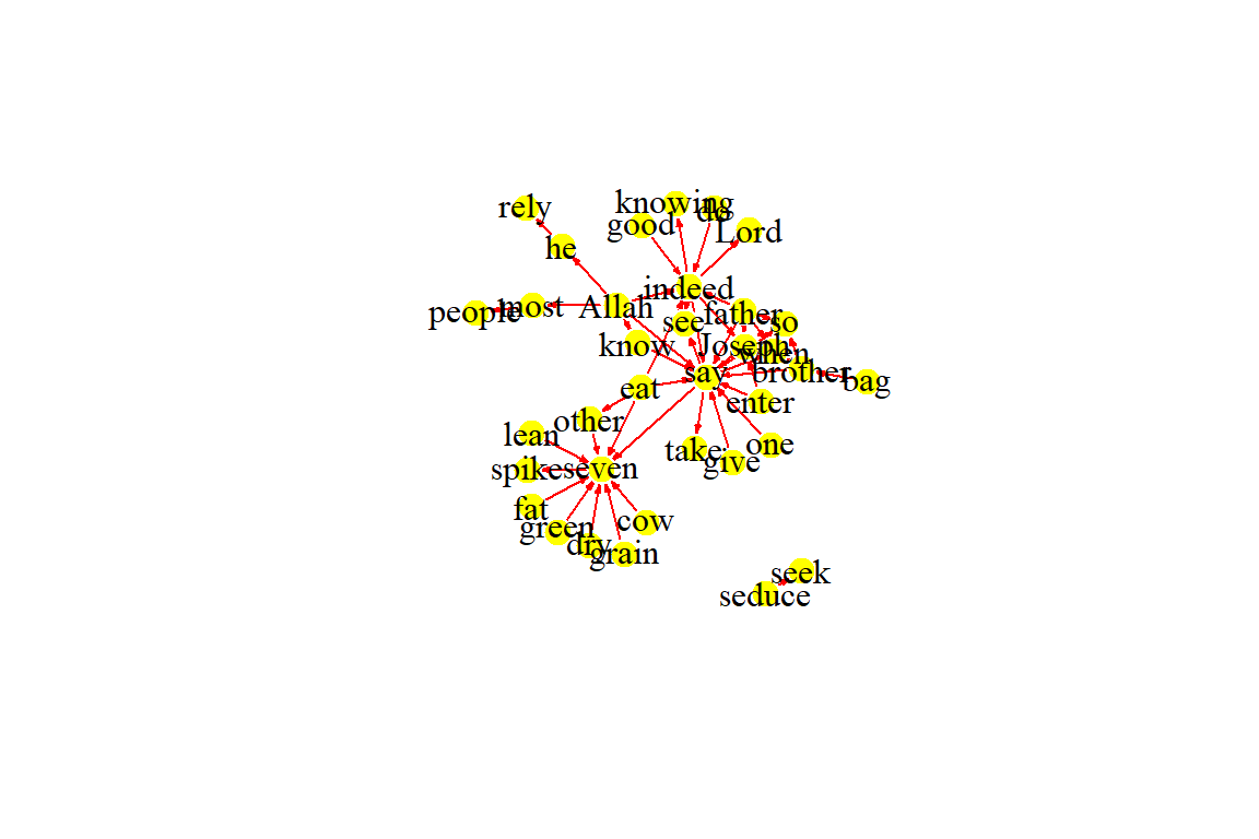
Figure 5.23: Adjust colors
Plot output is in Figure 5.23.
Compute node degrees (number of links) and use that to set node size:
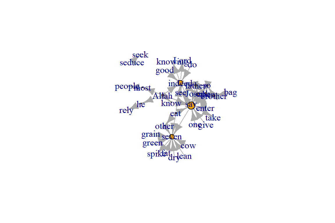
Figure 5.24: Adjust node size based on its degree
Plot output is in Figure 5.24.
deg <- degree(gm, mode="all")
V(gm)$size <- deg
plot(gm, vertex.size=igraph::degree(gm), vertex.label=NA)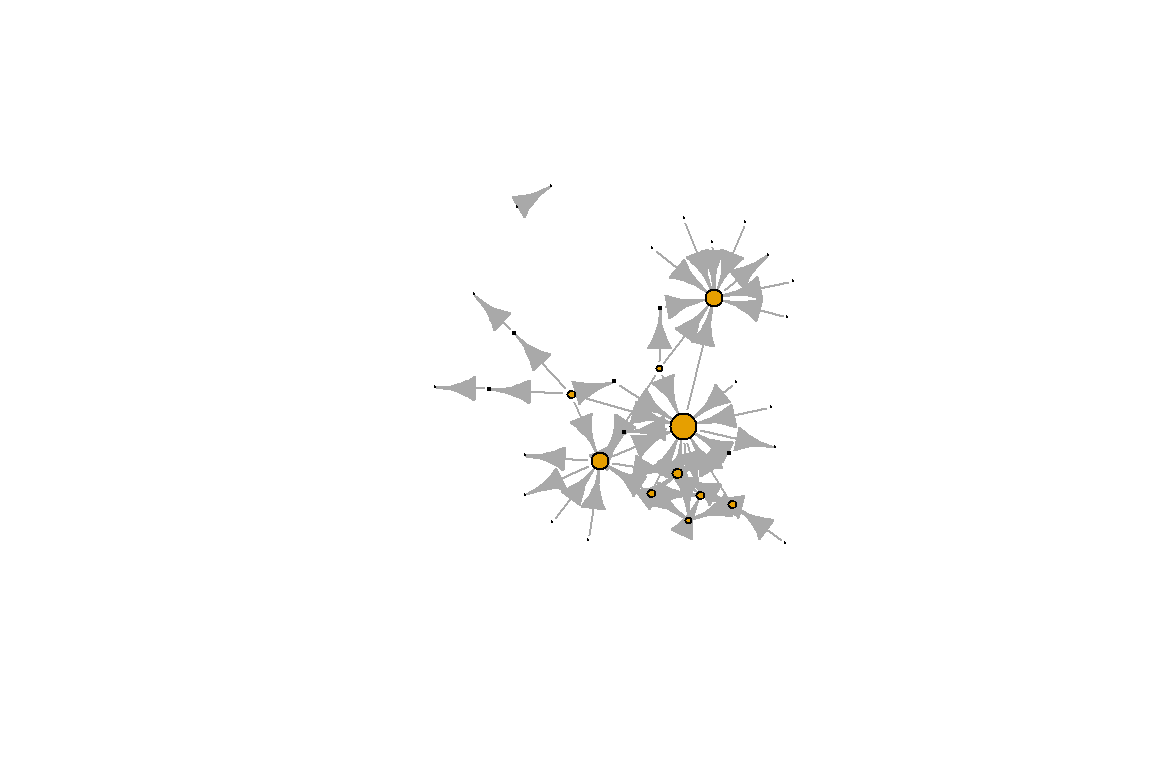
Figure 5.25: Remove node labels
Plot output is in Figure 5.25.
Set edge width based on number of co-occurrences:
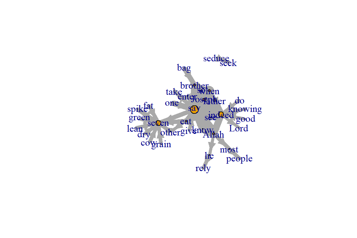
Figure 5.26: Adjust edge width based on number of co-occurrences
Plot output is in Figure 5.26.
We change the arrow size and edge color. We introduce and set the network layout in the next code. We will show other layouts later.
#change arrow size and edge color:
E(gm)$arrow.size <- .2
E(gm)$edge.color <- "deeppink2"
graph_attr(gm, "layout") <- layout_with_fr
plot(gm) 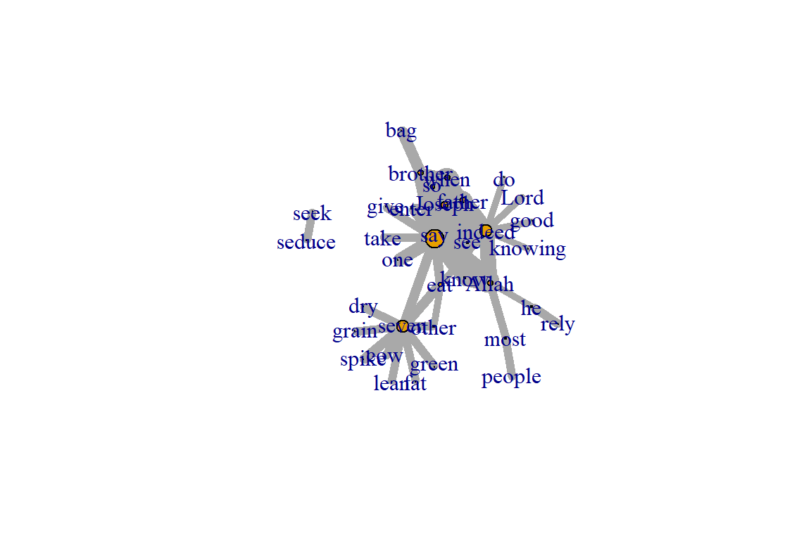
Figure 5.27: Adjust edge color and set layout
Plot output is in Figure 5.27.
Sometimes, especially with semantic networks, we plot only the labels of the nodes:
plot(gm, vertex.shape="none", vertex.label=V(gm)$name,
      vertex.label.font=2, vertex.label.color="blue",
      vertex.label.cex=.7, edge.color="gray85")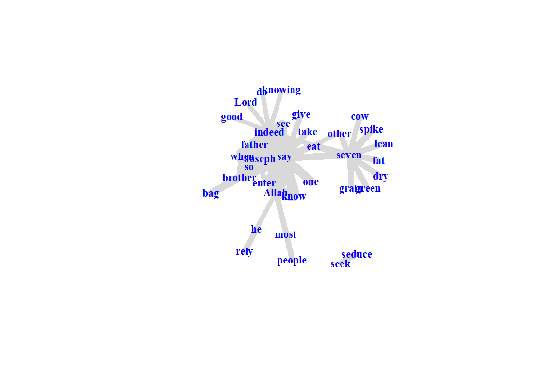
Figure 5.28: Adjust nodes highlighting only labels
Plot output is in Figure 5.28.
Color edges of graph based on their source node color:
- Get the starting node for each edge with the ends() igraph function.
- returns the start and end vertex for edges listed in the es parameter.
- names parameter controls whether the function returns edge names or IDs.
edge.start <- ends(gm, es=E(gm), names=F)[,1]
edge.col <- V(gm)$color[edge.start]
plot(gm, edge.color=edge.col, edge.curved=.1) 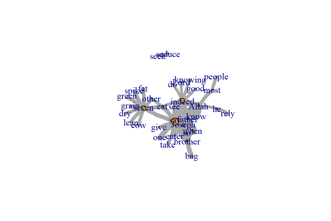
Figure 5.29: Adjust edge color based on the source node
Plot output is in Figure 5.29.
Color edges of graph based on the number of co-occurrences:
E(gm)[cooc <= 5]$color <- "red"
E(gm)[cooc > 5 & cooc <= 10]$color <- "yellow"
E(gm)[cooc > 10]$color <- "green"
plot(gm)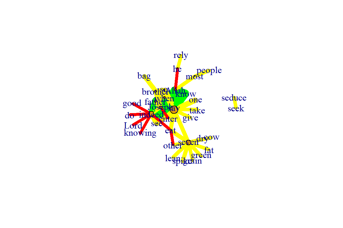
Figure 5.30: Adjust edge color based on formula
Plot output is in Figure 5.30.
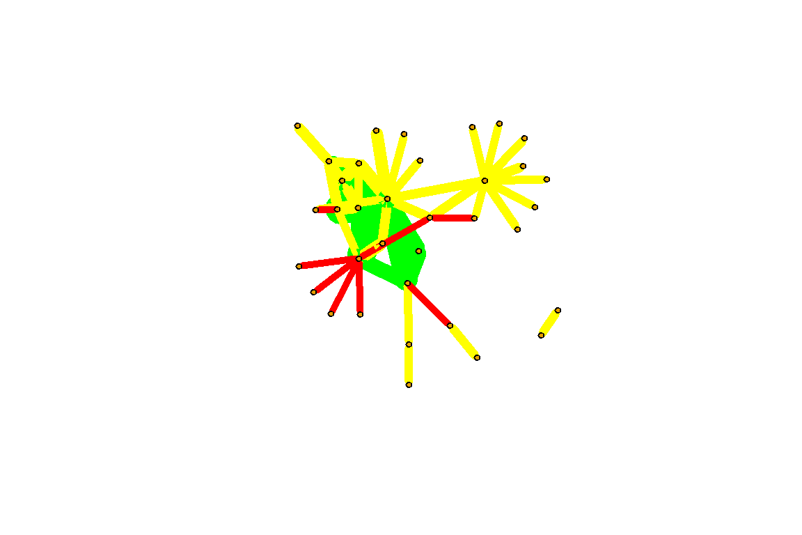
Figure 5.31: Adjust layout and remove label
Plot output is in Figure 5.31.
5.3.3 Graph layouts
Change the graph layout according to some algorithms already implemented in igraph. To adjust the figure we just have to assign a new layout:
- layout_with_dh
- layout_with_fr
- layout_with_kk
- layout_with_sugiyama
l<-layout_with_dh(gm)
plot(gm, vertex.color=vertex_attr(gm)$cor,
      vertex.size=igraph::degree(gm),
      edge.width=(edge_attr(gm)$weight)/100,
      edge.color="grey50",
      edge.curved=0.5,
      layout=l)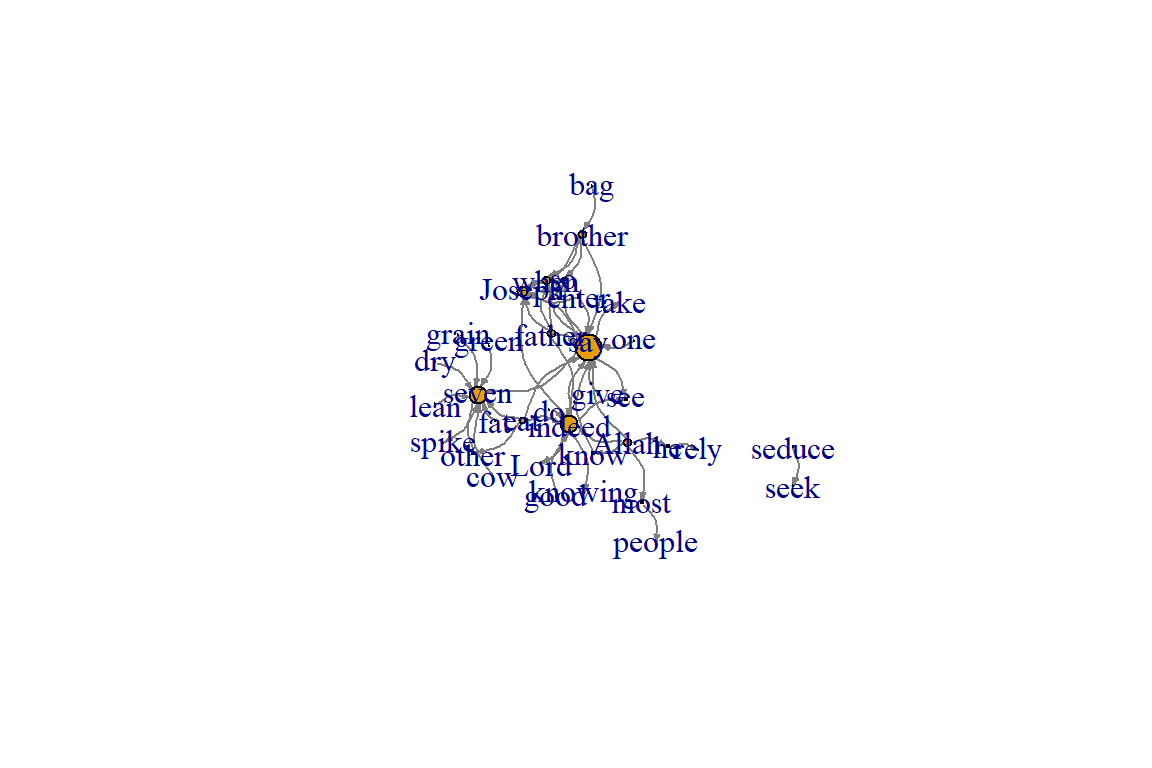
Figure 5.32: Using dh layout
Plot output is in Figure 5.32.
Other cool layouts:
plot(gm, vertex.color=vertex_attr(gm)$cor,vertex.label=NA,
     vertex.size=igraph::degree(gm),
     edge.width=(edge_attr(gm)$weight)/100,
     edge.color="grey50",
     edge.curved=0.3,
     layout=layout_in_circle, main="layout_in_circle")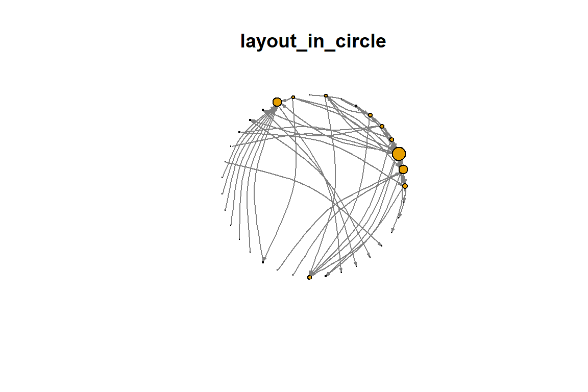
Figure 5.33: Layout in circle
Plot output is in Figure 5.33.
plot(gm, vertex.color=vertex_attr(gm)$cor,
     vertex.size=igraph::degree(gm),
     edge.width=(edge_attr(gm)$weight)/100,
     edge.color="grey50",
     layout=layout_as_tree, main="layout_as_tree")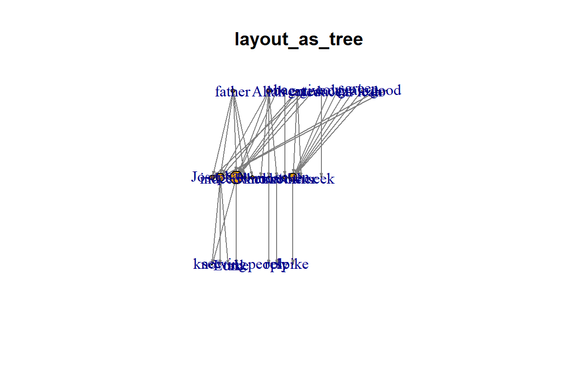
Figure 5.34: Layout as tree
Plot output is in Figure 5.34.
plot(gm, vertex.color=vertex_attr(gm)$cor,
     vertex.size=igraph::degree(gm),
     edge.width=3*(edge_attr(gm)$weight)/100,
     edge.color="grey50",
     layout=layout_as_star, main="layout_as_star")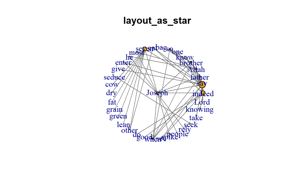
Figure 5.35: Layout as star
Plot output is in Figure 5.35.
Additional layouts:
- Use a simple program
- List the available layouts and then grep to select
layouts <- grep("^layout_", ls("package:igraph"),
                value=TRUE)[-1]
layouts <- layouts[!grepl("bipartite|merge|norm|sugiyama|tree",
                          layouts)]
par(mfrow=c(3,3), mar=c(1,1,1,1))
for (layout in layouts) {
      print(layout)
      l <- do.call(layout, list(gm))
      plot(gm, edge.arrow.mode=0, edge.width=1, layout=l,
           main=layout) }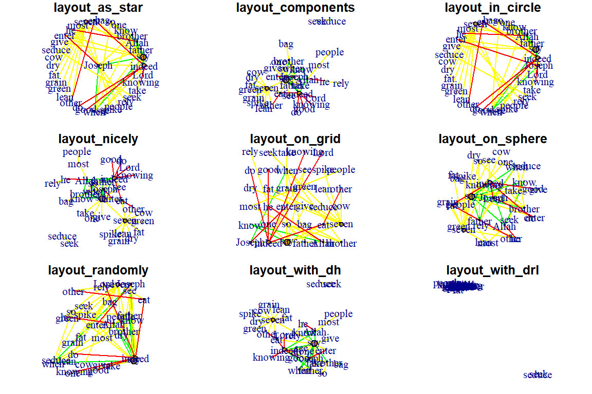
Figure 5.36: Additional layouts
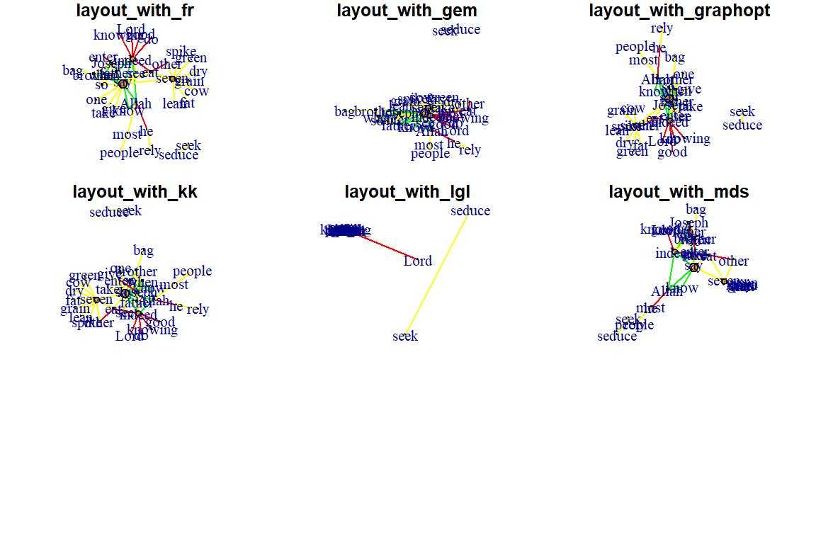
Figure 5.37: Additional layouts
Fruchterman-Reingold:
- One of the most used force-directed layout algorithms out there.
- Force-directed layouts try to get a nice-looking graph where edges are similar in length and cross each other as little as possible.
- They simulate the graph as a physical system.
- Nodes are electrically charged particles that repel each other when they get too close.
- Edges act as springs that attract connected nodes closer together.
- Thus nodes are evenly distributed through the chart area, and the layout is intuitive in that nodes that share more connections are closer to each other.
- The disadvantage of these algorithms is that they are rather slow and therefore less often used in graphs larger than about 1000 nodes.
- With force-directed layouts, you can use the niter parameter to control the number of iterations to perform.
- Default is set at 500 iterations.
- Lower that number for large graphs to get results faster and check if they look reasonable.
- The layout can also interpret edge weights. You can set the “weights” parameter which increases the attraction forces among nodes connected by heavier edges.
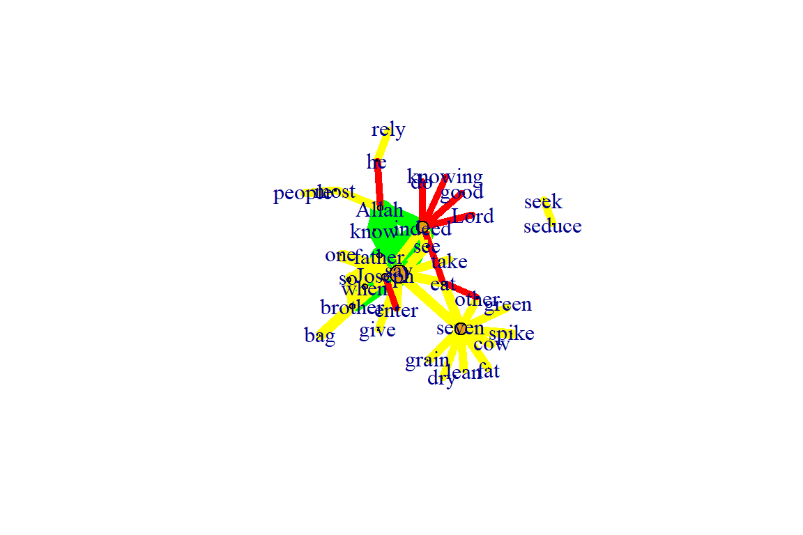
Figure 5.38: Using fr layout
Plot output is in Figure 5.38.
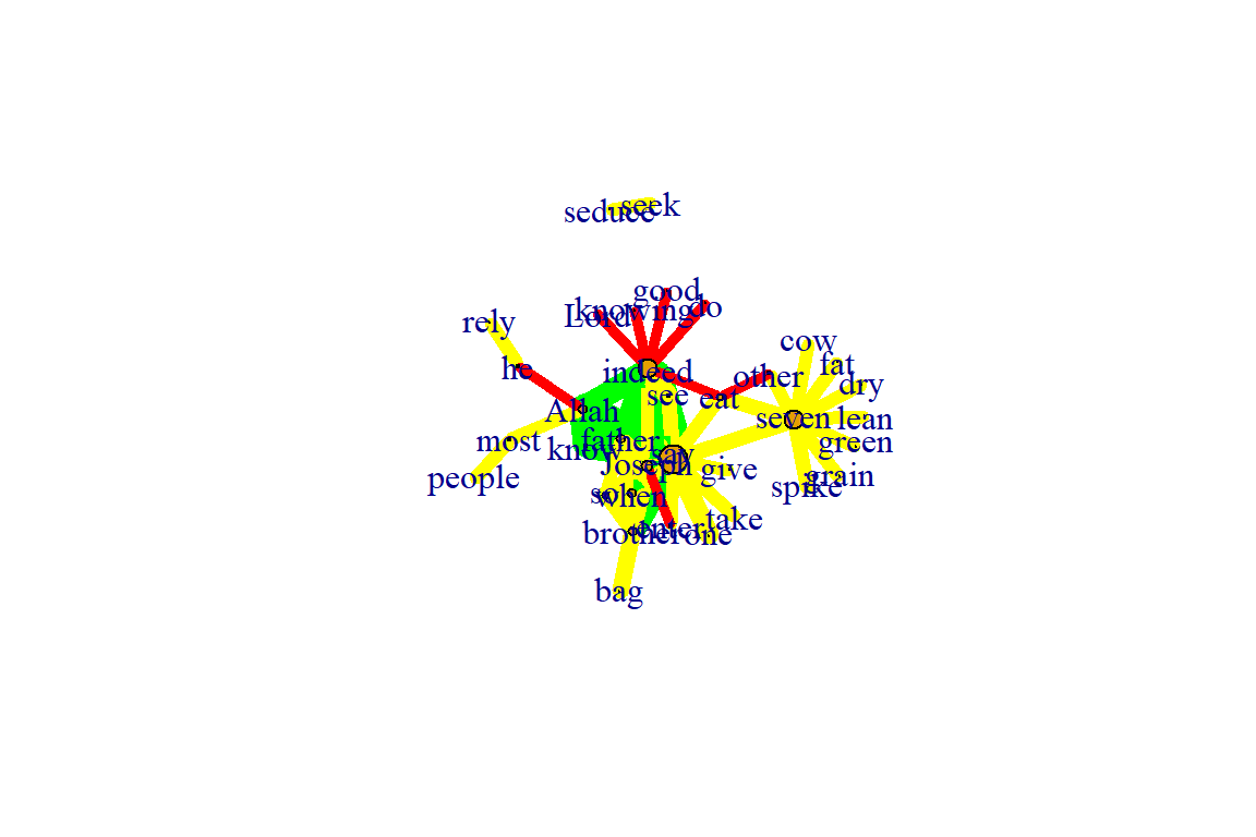
Figure 5.39: Using fr layout with 50 iterations
Plot output is in Figure 5.39.
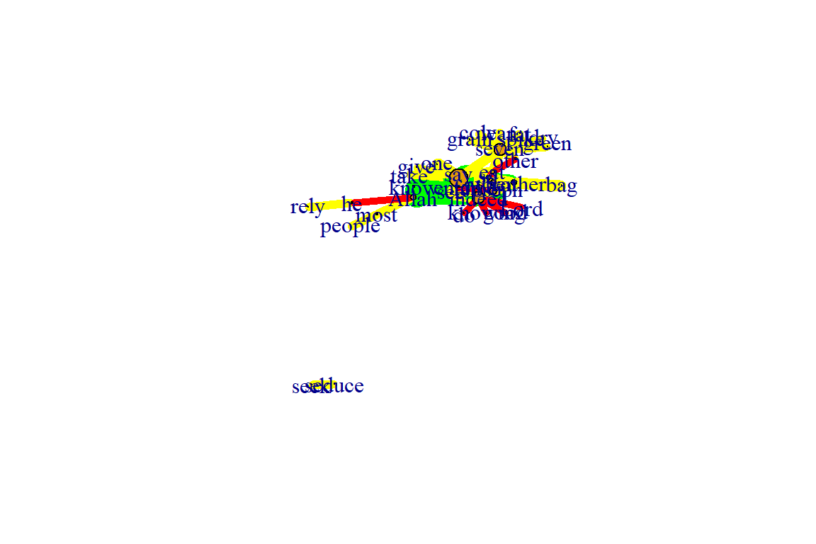
Figure 5.40: Using fr layout different weights
Plot output is in Figure 5.40.
Fruchterman-Reingold Non-Deterministic:
- Fruchterman-Reingold layout is not deterministic
- different runs will result in slightly different configurations.
- Saving the layout in l allows us to get the exact same result multiple times, which can be helpful if you want to plot the time evolution of a graph or different relationships – and want nodes to stay in the same place in multiple plots.
- By default, the coordinates of the plots are rescaled to the [-1,1] interval for both x and y.
- change that with the parameter rescale=FALSE and rescale plot manually by multiplying the coordinates by a scalar.
- use norm_coords to normalize the plot with the boundaries you want. This way you can create more compact or spread out layout versions.
par(mfrow=c(2,2), mar=c(0,0,0,0))
plot(gm, layout=layout_with_fr)
plot(gm, layout=layout_with_fr)
plot(gm, layout=l)
plot(gm, layout=l)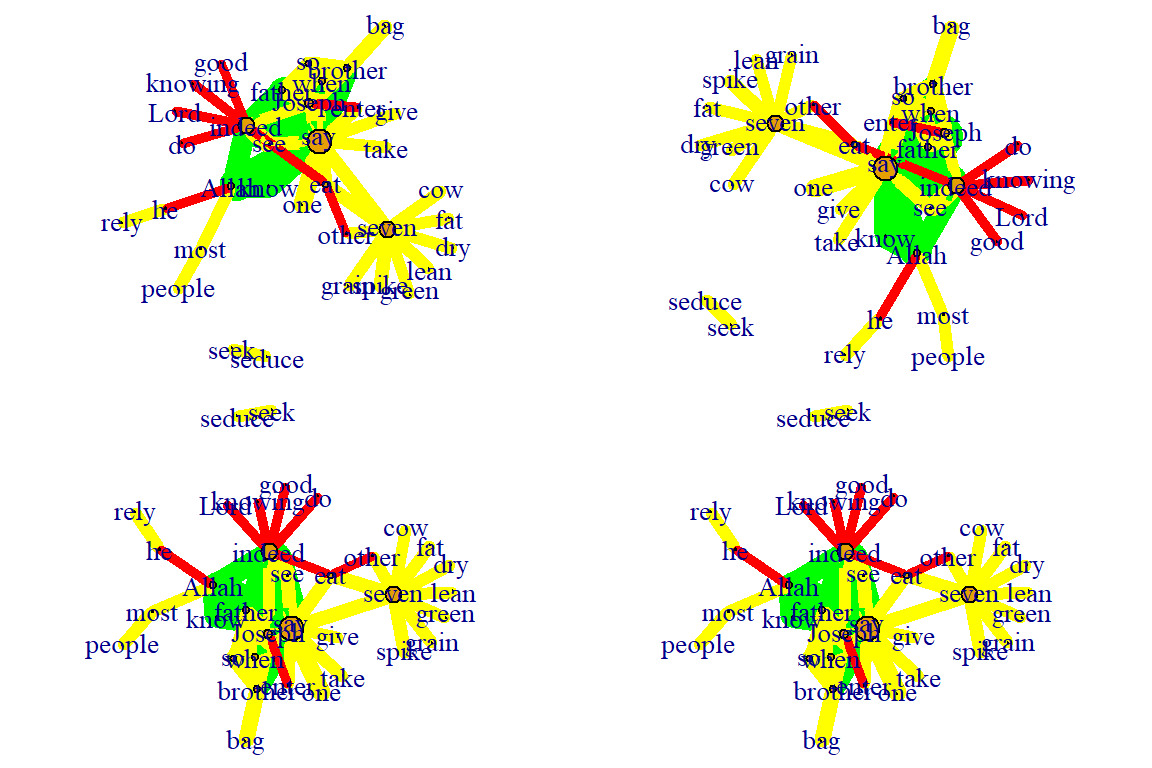
Figure 5.41: Each fr layout call with different outcomes
Plot output is in Figure 5.41.
l <- layout_with_fr(gm)
l <- norm_coords(l, ymin=-1, ymax=1, xmin=-1, xmax=1)

par(mfrow=c(2,2), mar=c(0,0,0,0))
plot(gm, rescale=F, layout=l*0.4)
plot(gm, rescale=F, layout=l*0.6)
plot(gm, rescale=F, layout=l*0.8)
plot(gm, rescale=F, layout=l*1.0)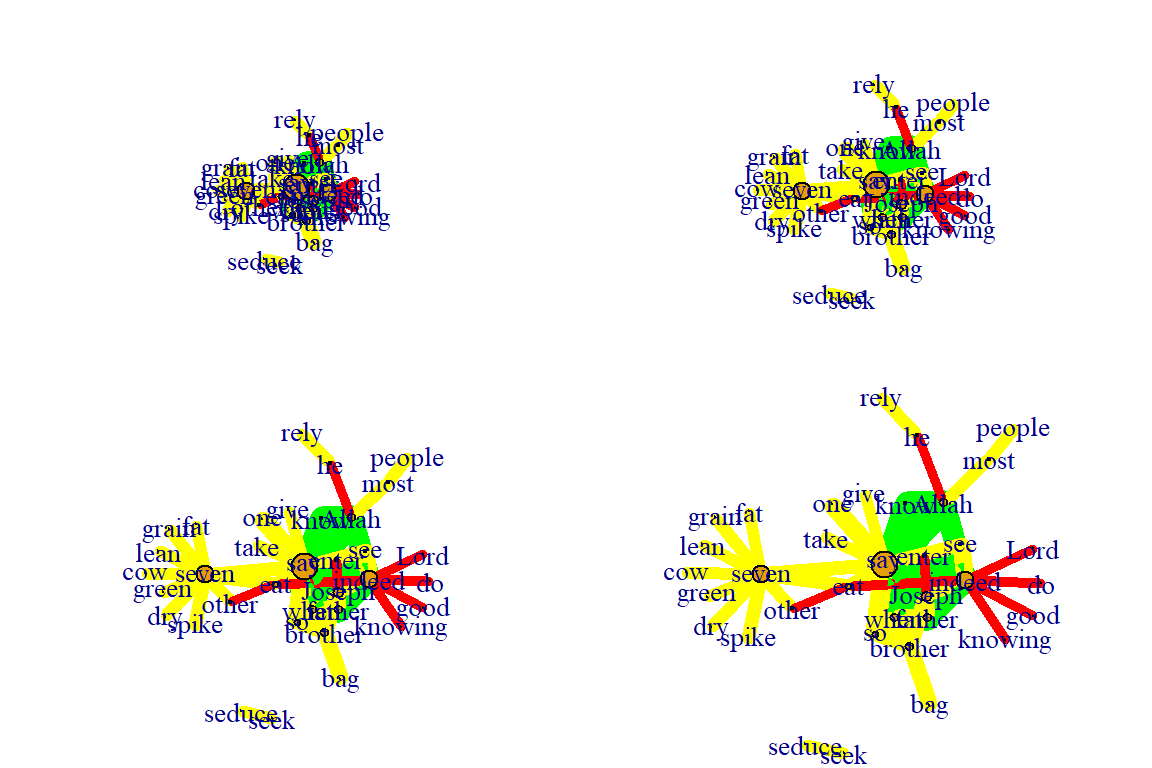
Figure 5.42: Using fr layout call with manual rescaling
Plot output is in Figure 5.42.
Kamada Kawai:
- Another popular force-directed algorithm that produces nice results for connected graphs.
- Like Fruchterman Reingold, it attempts to minimize the energy in a spring system.
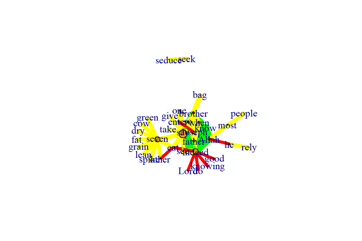
Figure 5.43: Using kk layout
Plot output is in Figure 5.43.
Graphopt:
- A nice force-directed layout implemented in igraph that uses layering to help with visualizations of large networks.
- The available graphopt parameters can be used to change the mass and electric charge of nodes, as well as the optimal spring length and the spring constant for edges. The parameter names are:
- charge (defaults to 0.001),
- mass (defaults to 30),
- spring.length (defaults to 0), and
- spring.constant (defaults to 1).
- Tweaking those can lead to considerably different graph layouts.
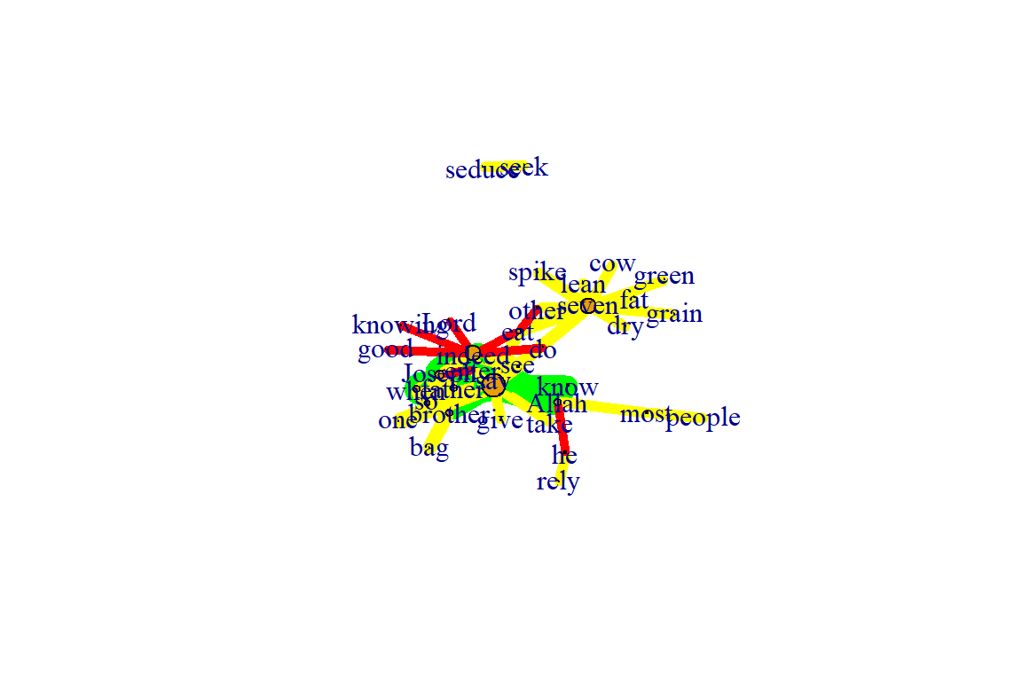
Figure 5.44: Using graphopt layout
Plot output is in Figure 5.44.
The charge parameter below changes node repulsion:
l1 <- layout_with_graphopt(gm, charge=0.02)
l2 <- layout_with_graphopt(gm, charge=0.00000001)

par(mfrow=c(1,2), mar=c(1,1,1,1))
plot(gm, layout=l1)
plot(gm, layout=l2)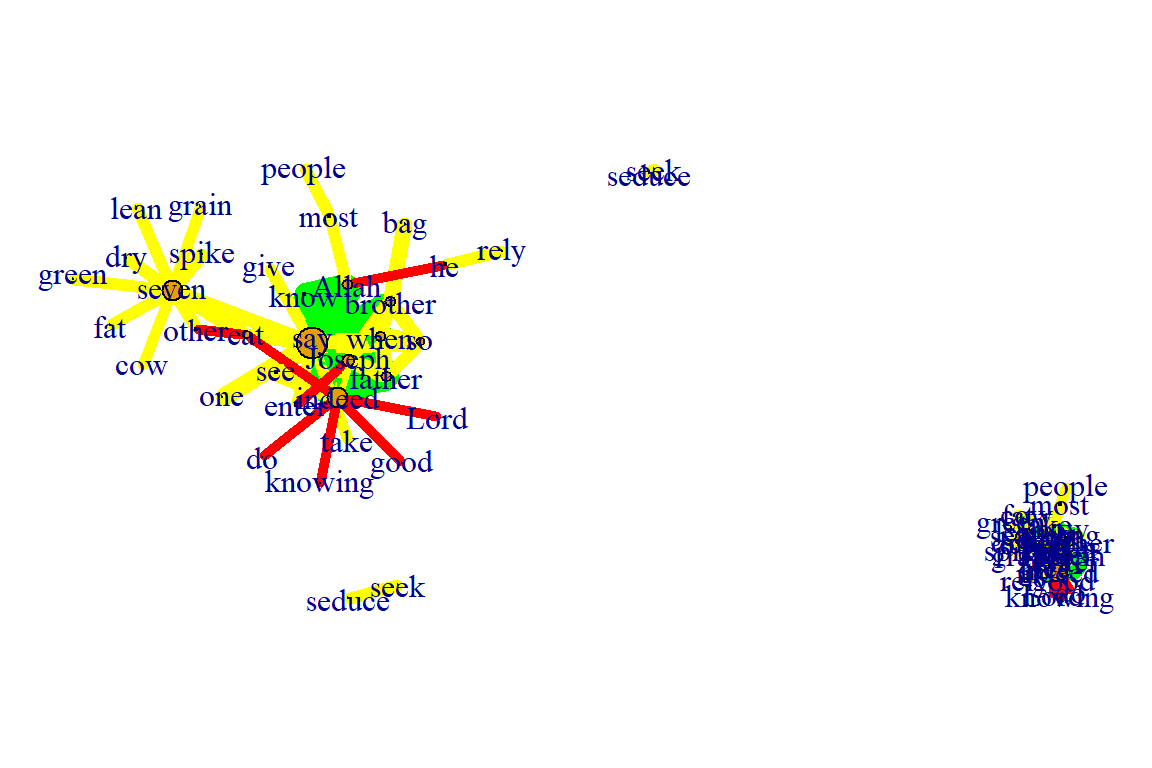
Figure 5.45: Using graphopt layout with different charge
Plot output is in Figure 5.45.
5.3.4 Graph algorithms
LGL algorithm:
- Meant for large, connected graphs.
- Here you can also specify a root, a node that will be placed in the middle of the layout.
par(mfrow=c(1,2), mar=c(1,1,1,1))
plot(gm, layout=layout_with_lgl, root = 1)
plot(gm, layout=layout_with_lgl, root = 5)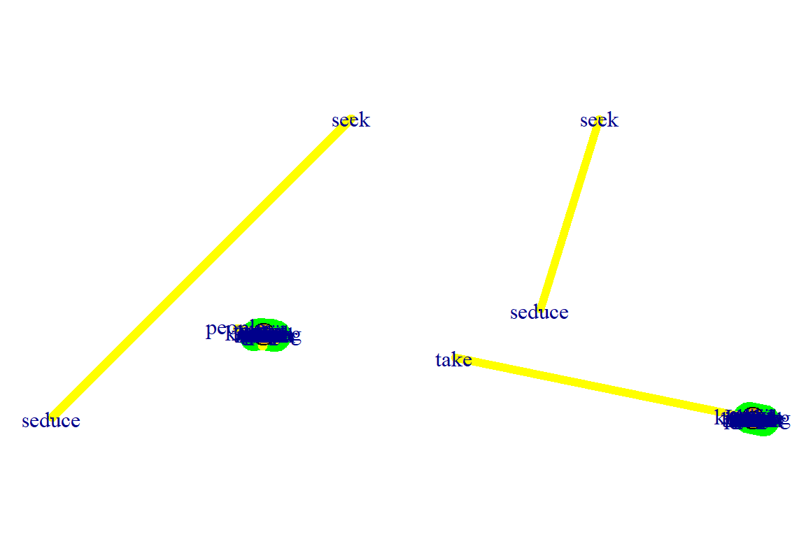
Figure 5.46: Using lgl layout with different roots
Plot output is in Figure 5.46.
The MDS (multidimensional scaling) algorithm:
- Tries to place nodes based on some measure of similarity or distance between them. More similar nodes are plotted closer to each other.
- By default, the measure used is based on the shortest paths between nodes in the network.
- We can change that by using our own distance matrix (however defined) with the parameter dist.
- MDS layouts are nice because positions and distances have a clear interpretation.
- The problem with them is visual clarity: nodes often overlap, or are placed on top of each other.
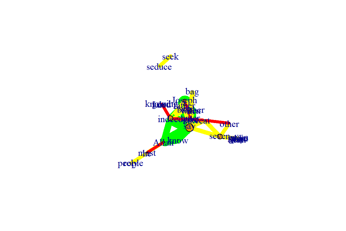
Figure 5.47: Using mds layout
Plot output is in Figure 5.47.
5.3.5 Graph analysis
- igraph has several built-in functions to analyze graph properties.
- We can check for communities or clusters with a choice of algorithms.
- cluster_spinglass()
- cluster_optimal()
- cluster_walktrap()
- We will calculate modularity using the cluster_spinglass function, which uses simulated annealing for optimization:
- Some of the clustering functions give error results for networks with unconnected nodes.
- It is obvious from the previous plots that the nodes “seek” and “seduce” are unconnected with the rest.
- The code below shows how to use the delete_vertices() function.
gm1 <- delete_vertices(gm, "seek")
gm1 <- delete_vertices(gm1, "seduce")
gmc <- cluster_spinglass(gm1)
str(gmc) #evaluating output
gmc$membership #checking to which module each node belongs to
plot(gm1, vertex.color=vertex_attr(gm1)$cor,
     vertex.size = 3*degree(gm1),
     edge.width = edge_attr(gm1)$coor,
     edge.color = "grey50",
     edge.curved = 0.3,
     layout = layout_with_kk,
     mark.groups = gmc,
     mark.border=NA)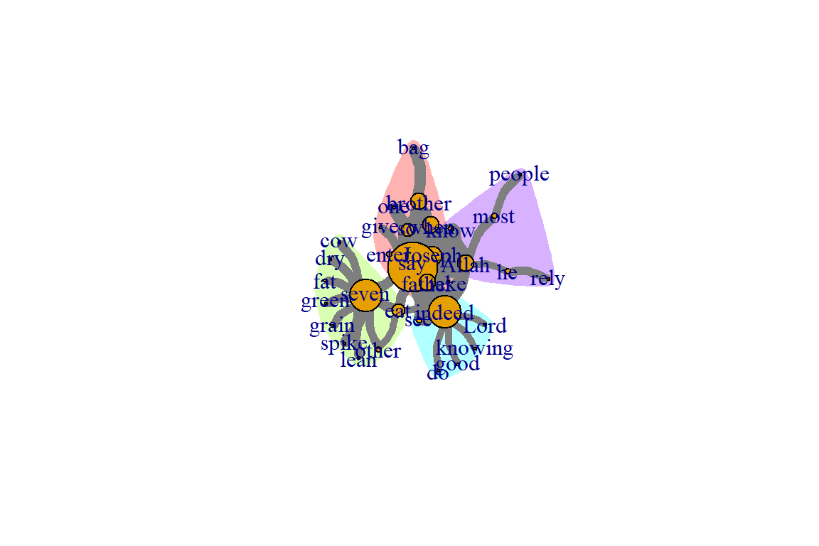
Figure 5.48: Communities or clusters in tutorial word network
Plot output is in Figure 5.48.
Calculate and plot the shortest path between two nodes:
- To emphasize the path between them, we create a new color vector for interactions (edges) the same way we did before for the nodes/vertices:
short.path <- shortest_paths(gm, from = "Joseph", to = "seven", output = "both")
short.path
# creating a color vector for all the edges with the color "grey80";
# the ecount fucntion tells you how many edges the network has
ecol <- rep("gray80", ecount(gm))
# coloring in red only the path in which we are interested,
# that we calculed using the shortest_paths function.
ecol[unlist(short.path$epath)] <- "red"
l <- layout_with_kk(gm)
plot(gm, vertex.color=vertex_attr(gm)$cor,
     vertex.size=igraph::degree(gm),
     edge.width=2,
     edge.color=ecol,
     layout=l)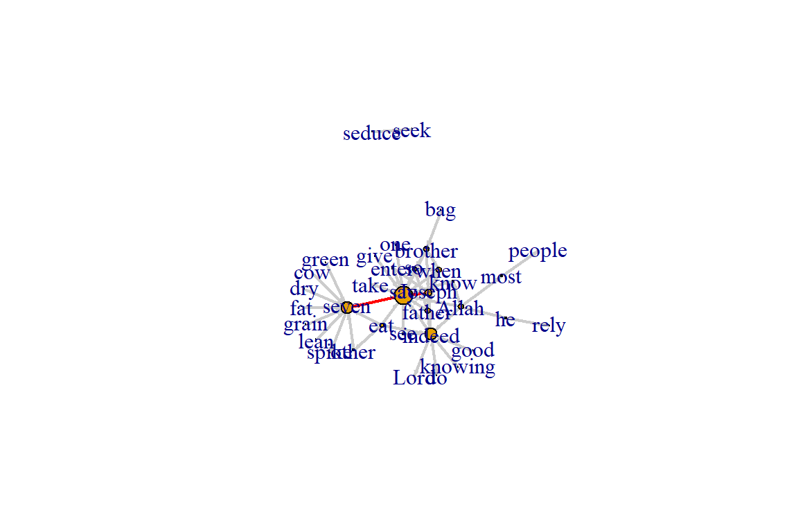
Figure 5.49: Path from one node to another
Plot output is in Figure 5.49.
5.3.6 Using ggraph
- The ggplot2 package and its extensions are known for offering a more meaningfully structured and advanced way to visualize data in R.
- In ggplot2, we can select from a variety of visual building blocks and add them to our graphics one by one, a layer at a time.
- The ggraph package takes this principle and extends it to network data. In this section, we will only cover the basics.
- We can use our igraph objects directly with the ggraph package.
- The following code gets the data and adds separate layers for nodes and links.
library(ggraph)
lay = create_layout(gm, layout = "kk")
ggraph(lay) +
  geom_edge_link() +
  geom_node_point() +
  theme_graph()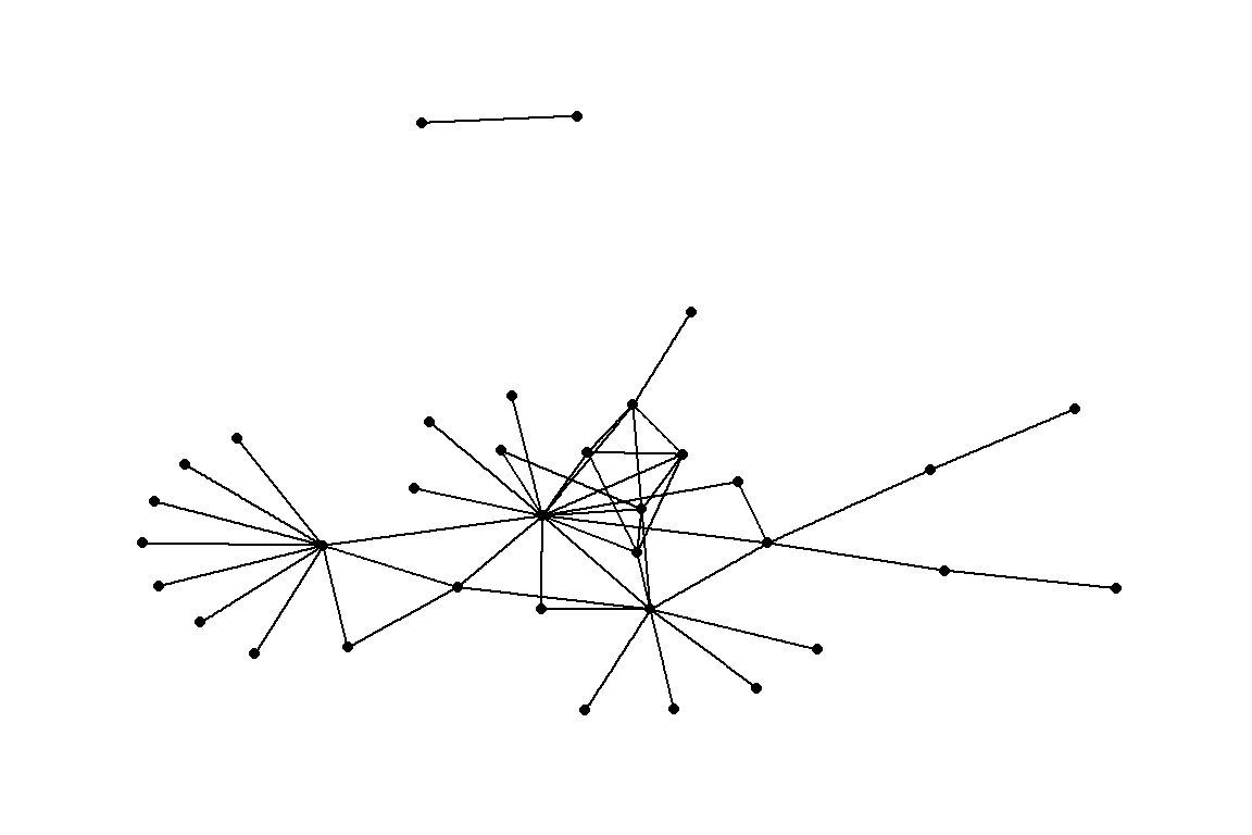
Figure 5.50: Using ggraph with minimal parameters set
Plot output is in Figure 5.50.
Add node names and edge type:
ggraph(lay) +
    geom_edge_link() +
    geom_node_point() +
    geom_node_text(aes(label = name), repel=TRUE) +
    geom_edge_link(aes(color = cooc))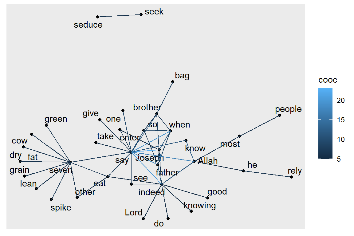
Figure 5.51: ggraph with node and edge parameters set
Plot output is in Figure 5.51.
Plot node degree as node size (and alpha):
ggraph(lay) +
    geom_node_point() +
    geom_node_text(aes(label = name), repel=TRUE) +
    geom_node_point(aes(size = degree(gm), alpha = degree(gm)),
                    color = "#de4e96") +
    geom_edge_link(aes(color = cooc))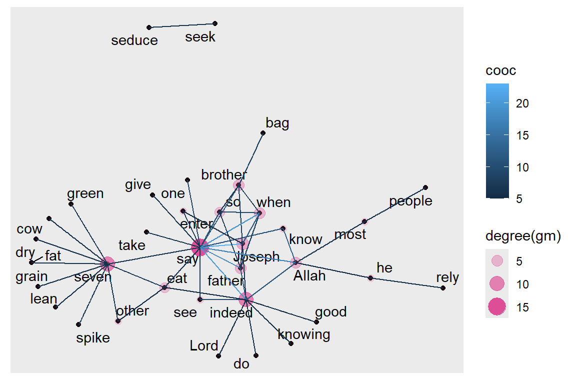
Figure 5.52: ggraph with node size and alpha based on degree
Plot output is in Figure 5.52.
Plot edge weight as edge alpha:
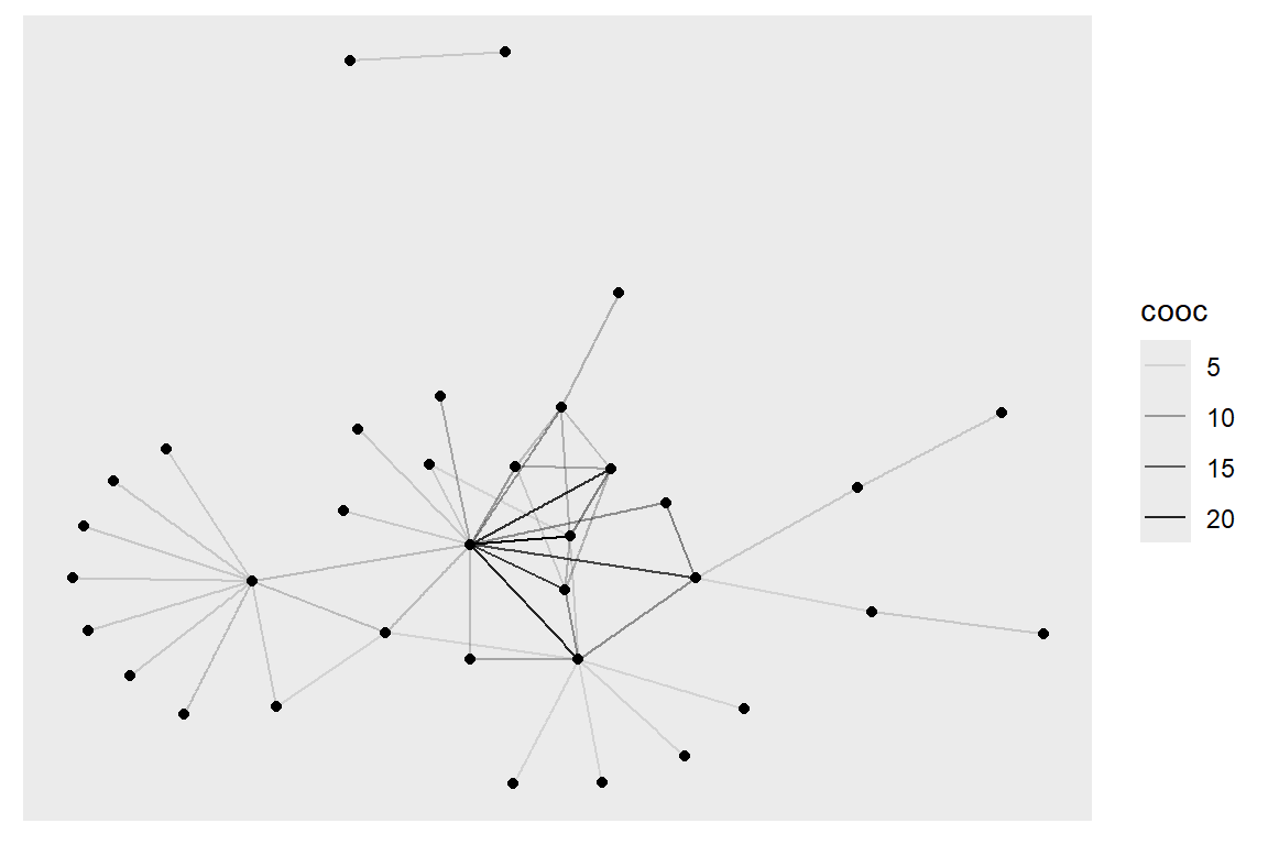
Figure 5.53: ggraph with edge width and alpha based on number of co-occurrences
Plot output is in Figure 5.53.
Layouts in ggraph:
- Some network layouts are familiar from igraph:
- ‘star’, ‘circle’, ‘grid’, ‘sphere’, ‘kk’, ‘fr’, ‘mds’, ‘lgl’, etc.
- We can use geom_edge_link() for straight edges, geom_edge_arc() for curved ones, and geom_edge_fan() when we want to make sure any overlapping multiplex edges will be fanned out.
- We can set visual properties for the network plot by using key function parameters.
- Nodes have color, fill, shape, size, and stroke.
- Edges have color, width, and linetype.
- alpha parameter controls transparency.
ggraph(gm, layout="kk") +
  geom_edge_link() +
  ggtitle("Your Title Here") +  # add title to the plot
  geom_edge_fan(color="gray50", width=0.8, alpha=0.5) +
  geom_node_point(size=2) +
  theme_void()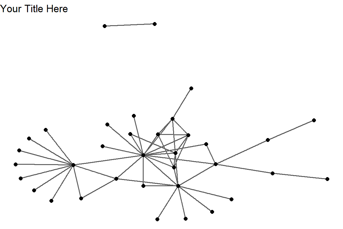
Figure 5.54: Using ggraph with layout kk
Plot output is in Figure 5.54.
Different themes:
- As in ggplot2, we can add different themes to the plot.
- For a cleaner look, we can use a minimal or empty theme with theme_minimal() or theme_void().
ggraph(gm, layout = 'linear') +
    geom_edge_arc(color = "gold3", width=0.7) +
    geom_node_point(size=3, color="gray50") +
    geom_node_text(aes(label = name), repel=TRUE, size = 3) +
    theme_void()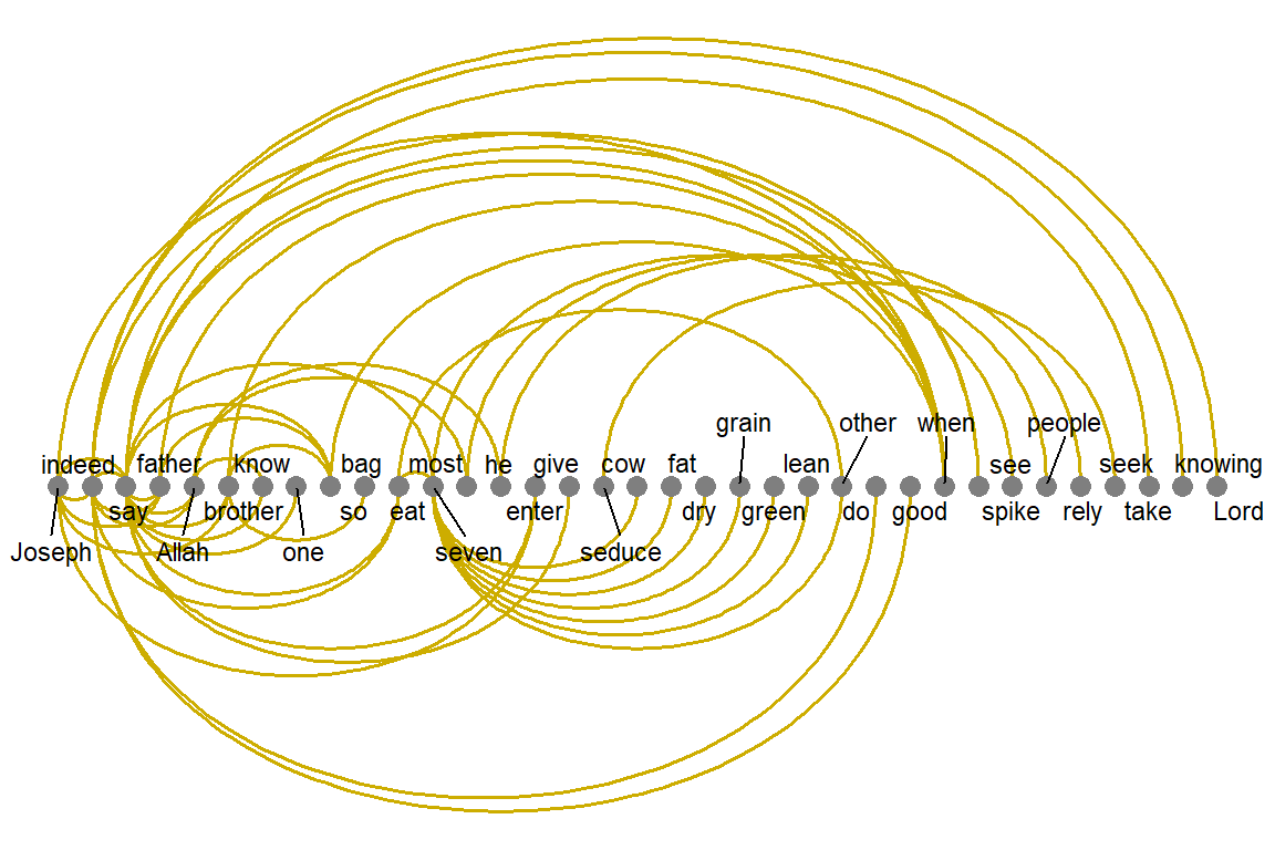
Figure 5.55: Using ggraph with linear layout and void theme
Plot output is in Figure 5.55.
Mapping aesthetics:
- The ggraph package also uses the traditional ggplot2 way of mapping aesthetics: specifying which elements of the data should correspond to different visual properties of the graphic.
- It is done using the aes() function that matches visual parameters with attribute names from the data.
- In the code below, the edge attribute type and node attribute audience.size are taken from our data as they are included in the igraph object.
ggraph(gm, layout="kk") +
  geom_edge_link(aes(color = cooc)) +
  geom_node_point(aes(size = degree(gm))) +
  theme_void()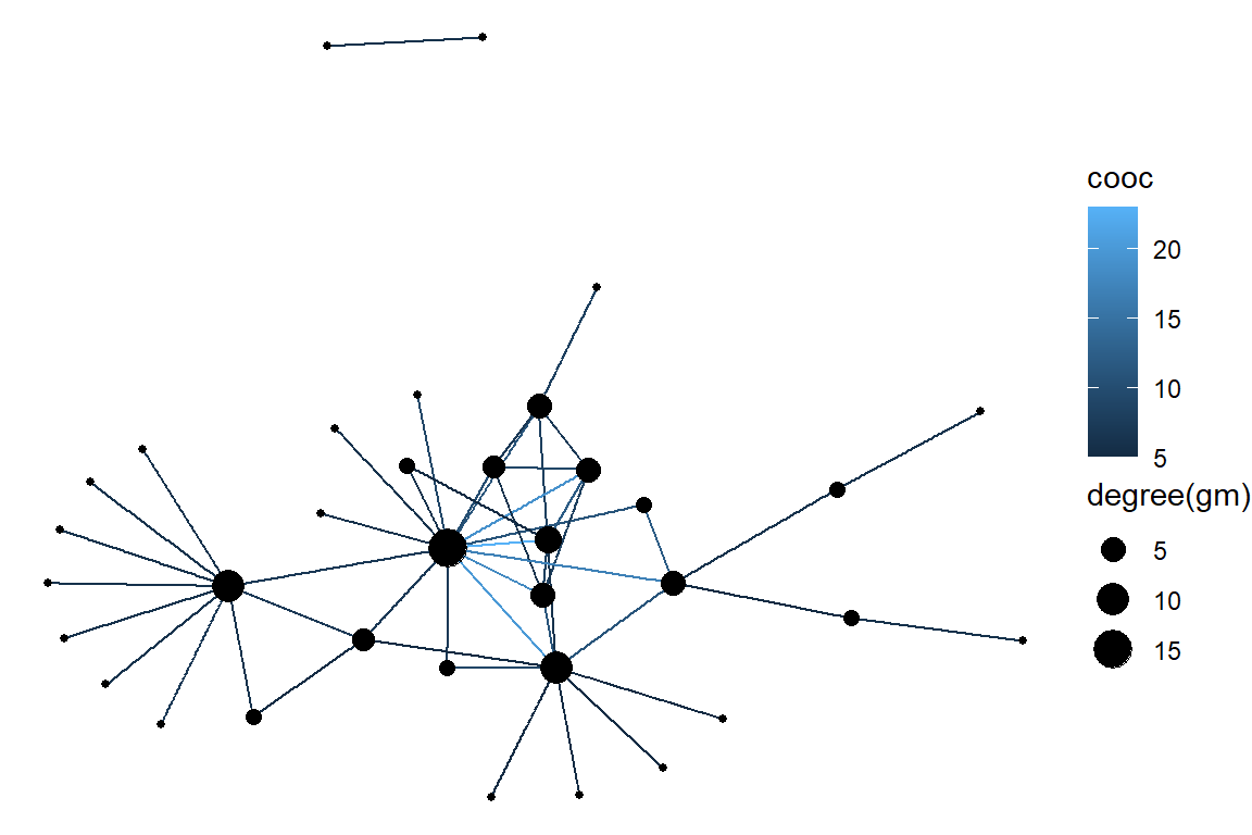
Figure 5.56: Using ggraph with kk layout and aes setting
Plot output is in Figure 5.56.
Legends:
- One great thing about ggplot2 and ggraph we can see above is that they automatically generate a legend which makes plots easier to interpret.
- We can add a layer with node labels using geom_node_text() or geom_node_label() which correspond to similar functions in ggplot2.
ggraph(gm,  layout = 'kk') +
  geom_edge_arc(color="gray", curvature=0.3) +
  geom_node_point(color="#de4e96", aes(size = degree(gm))) +
  geom_node_text(aes(label = name), size=3, color="darkblue",
                 repel=T) +
  theme_void()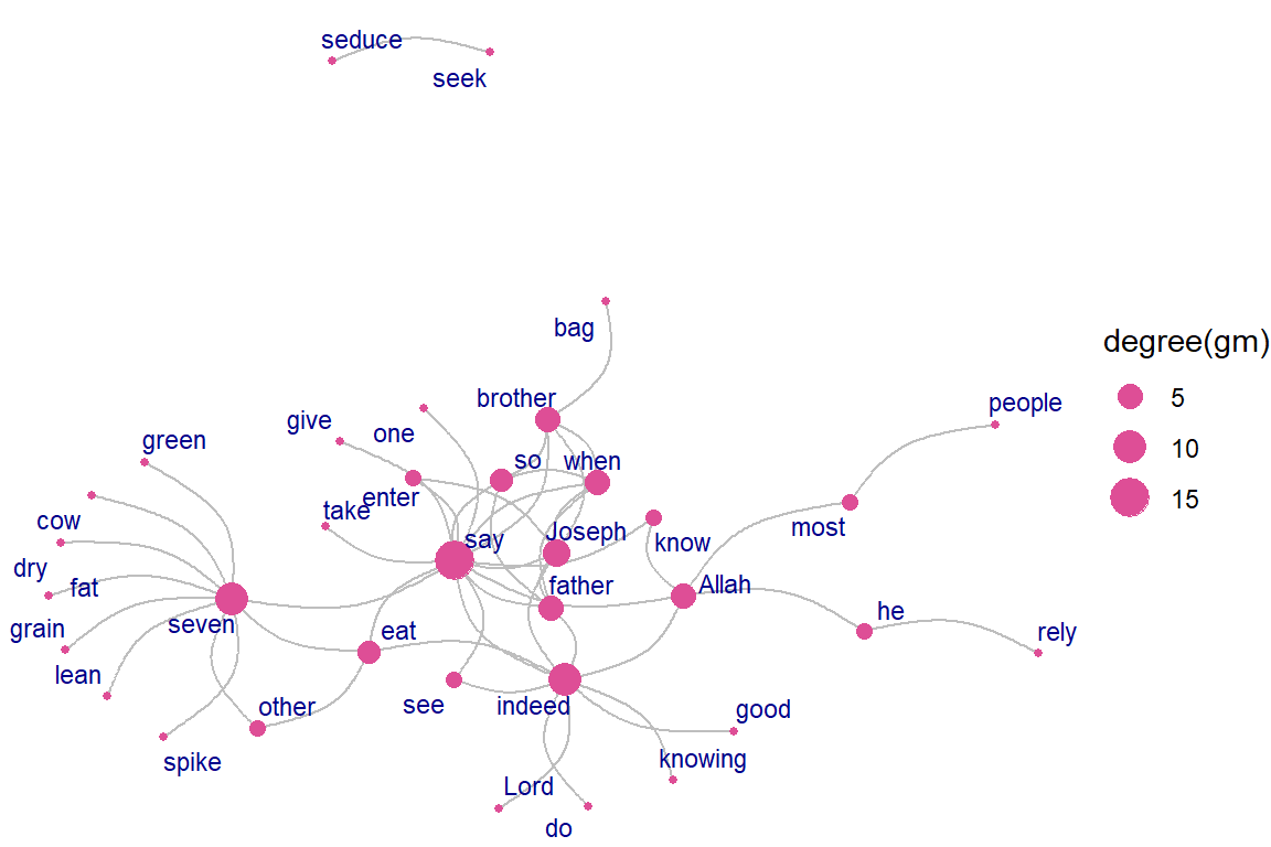
Figure 5.57: Using ggraph with various parameter settings
Plot output is in Figure 5.57.
Arc and Coord:
- ggraph provides some new layout types and algorithms for our drawing pleasure
ggraph(gm, layout = 'linear',  circular = TRUE) +
     geom_edge_arc(aes(color = cooc)) +
     geom_node_point() +
     geom_node_text(aes(label = name), size=3, color="darkblue",
                    repel=T)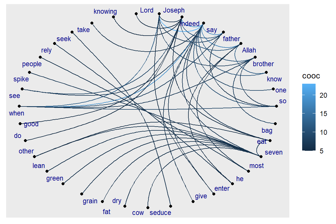
Figure 5.58: Using ggraph with linear layout
Plot output is in Figure 5.58.
Fan:
- Sometimes the graph is not simple, i.e. it has multiple edges between the same nodes.
- Using links is a bad choice here because edges will overlap and the viewer will be unable to discover parallel edges.
- geom_edge_fan() helps here.
- If there are no parallel edges it behaves like geom_edge_link() and draws a straight line.
- If parallel edges exist it will spread them out as arcs with different curvature.
- Parallel edges will be sorted by directionality before plotting so edges flowing in the same direction will be plotted together.
ggraph(gm, layout = 'kk') +
     geom_edge_fan(aes(color = cooc, width = cooc)) +
     geom_node_point() +
     geom_node_text(aes(label = name), size=3, color="darkred",
                    repel=T)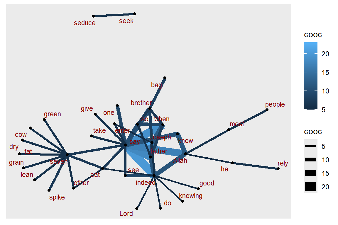
Figure 5.59: Using ggraph with edge fan
Plot output is in Figure 5.59.
Density:
- Consider the case where it is of interest to see which types of edges dominate certain areas of the graph.
- We can color the edges, but edges can tend to get overplotted, thus reducing readability.
- geom_edge_density() lets us add shading to our plot based on the density of edges in a certain area:
ggraph(gm, layout = 'kk') +
     geom_edge_density(aes(fill = cooc)) +
     geom_edge_link(alpha = 0.25, color = "steelblue") +
     geom_node_point(color="#de4e96", aes(size = igraph::degree(gm)))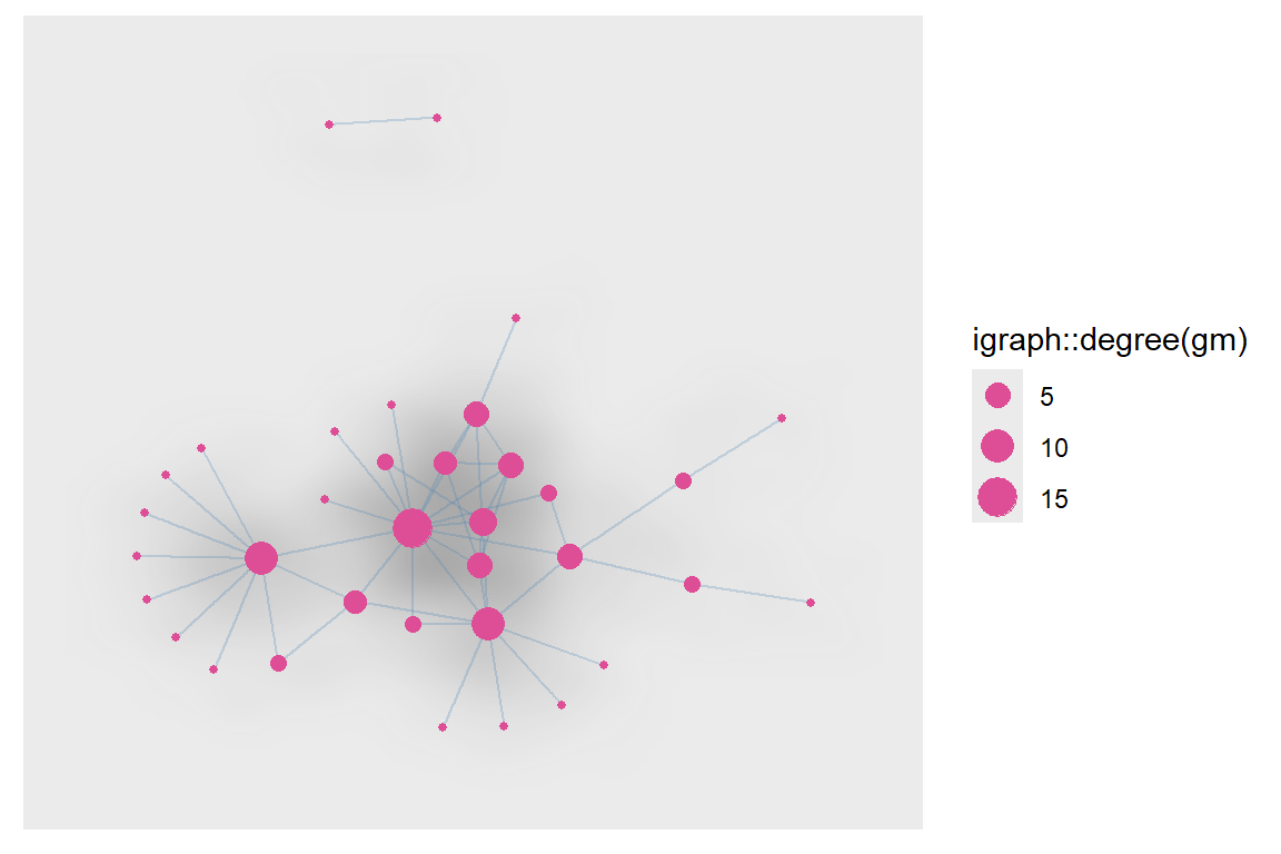
Figure 5.60: Using ggraph with edge density
Plot output is in Figure 5.60.
Other ways to represent a network:
- ggraph offers several other interesting ways to represent networks, including dendrograms, treemaps, hive plots, and circle plots.
- We show below a simple heatmap of our network matrix.
netm <- get.adjacency(gm, attr="cooc", sparse=F)
colnames(netm) <- V(gm)$name
rownames(netm) <- V(gm)$name
palf <- colorRampPalette(c("yellow", "red"))
heatmap(netm[,17:1], Rowv = NA, Colv = NA, col = palf(100),
        scale="none", margins=c(10,10) )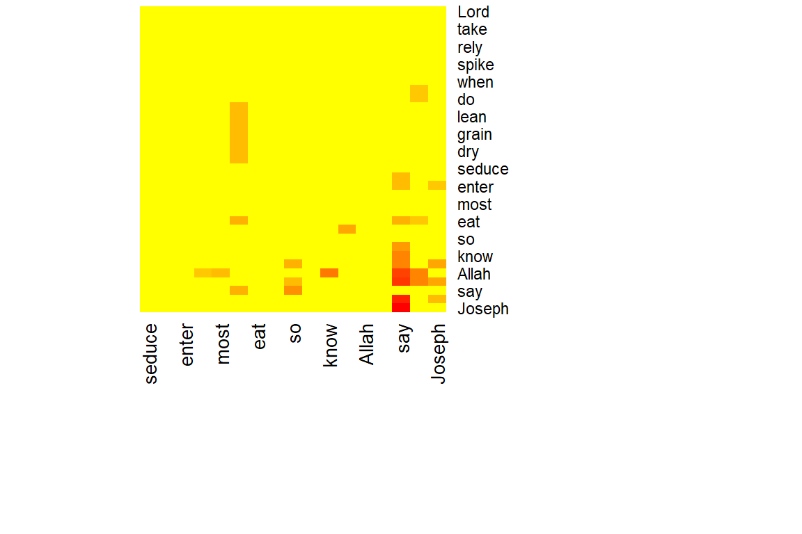
Figure 5.61: Heatmap of word network
Plot output is in Figure 5.61.
Plot the degree distribution for our network:
- Depending on what properties of the network or its nodes and edges are most important to us, simple graphs can often be more informative.
deg.dist <- degree_distribution(gm, cumulative=T, mode="all")
plot( x=0:max(degree(gm)), y=1-deg.dist, pch=19, cex=1.2, col="orange",
      xlab="Degree", ylab="Cumulative Frequency")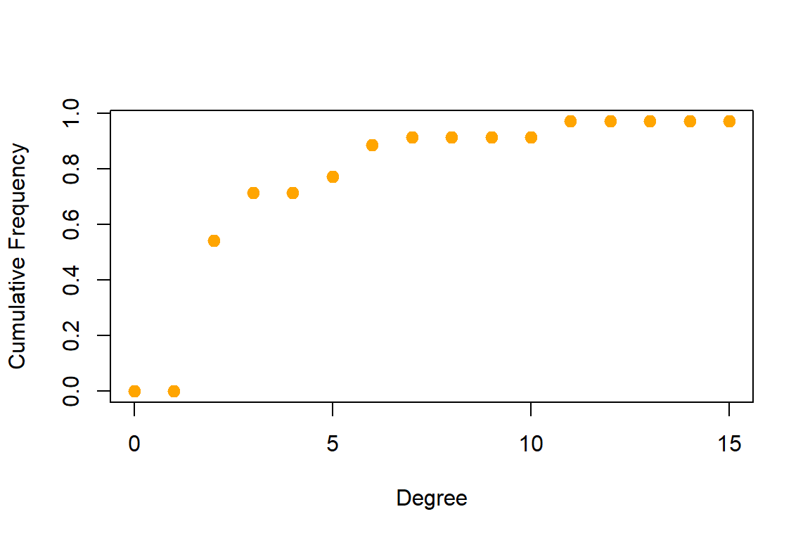
Figure 5.62: Degree distribution of word network
Plot output is in Figure 5.62.
5.4 Fun with network graphs
Let us have some light moments working with network graphs. We have seen the various network layout options, and also for geom_edge_density, geom_edge_link, geom_node_point, geom_node_text. Different combinations of these options can result in interesting and fun ways to represent network graph data.
Digital art is one interesting aspect of visualizing data. We will show an example in this section. For that, we increase the network size of the word co-occurrences in Surah Yusuf and explore.
wordnetwork <- head(cooccur, 100)
gm1 <- graph_from_data_frame(wordnetwork)
ggraph(gm1, layout = 'kk') +
      geom_edge_density(aes(fill = cooc)) +
      geom_edge_link(alpha = 0.7, color = "#57d3e6") +
      geom_node_point(aes(size = degree(gm1)), colour = "#a83268") +
      geom_node_text(aes(label = name), size = 3, repel=TRUE) +
      ggtitle("Network of Top 100 Words")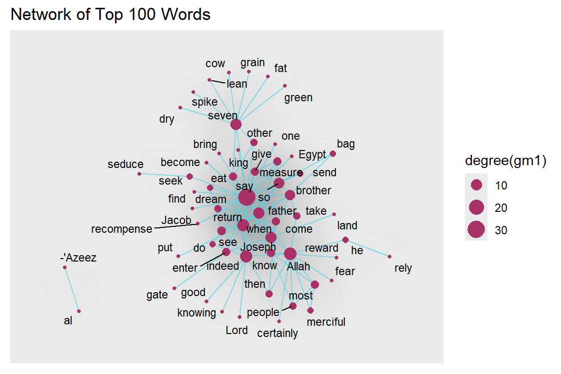
Figure 5.63: Larger network density with labels
Plot output is in Figure 5.63.
ggraph(gm1, layout = 'kk') +
      geom_edge_density(aes(fill = cooc)) +
      geom_edge_link(alpha = 0.7, color = "#57d3e6") +
      geom_node_point(aes(size = degree(gm1)),
                      colour = "#a83268") +
      ggtitle("Network of Top 100 Words")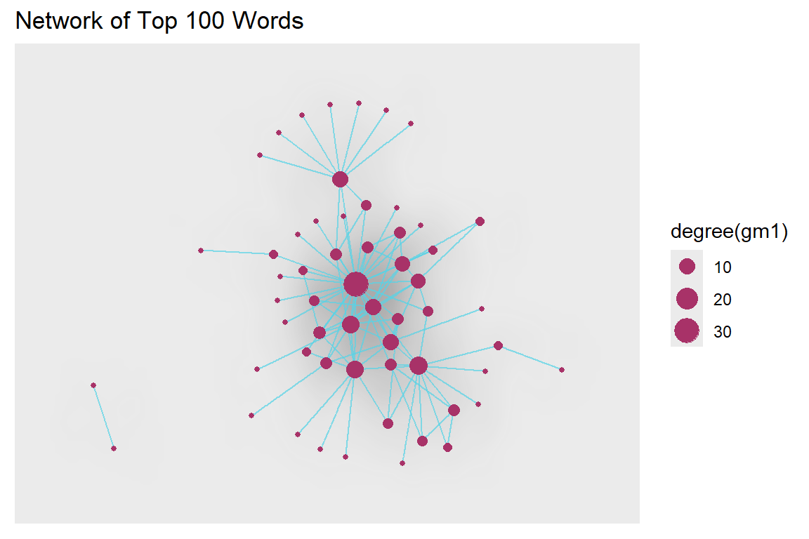
Figure 5.64: Larger network density without labels
Plot output is in Figure 5.64.
We remove the title and legend. We encourage our readers to try different combinations of colors, alphas, and network size. Surah Yusuf is a beautiful Surah. The word co-occurrence network of this Surah looks quite pretty too.
ggraph(gm1, layout = 'kk') +
      geom_edge_density(aes(fill = cooc)) +
      geom_edge_link(alpha = 0.7, color = "#57d3e6") +
      geom_node_point(aes(size = degree(gm1)),
                      colour = "#a83268", show.legend = FALSE)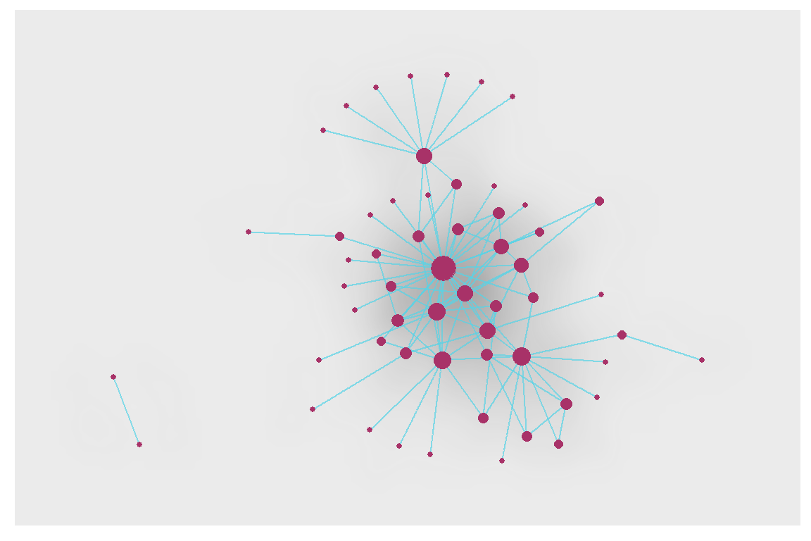
Figure 5.65: Digital art from Surah Yusuf
Plot output is in Figure 5.65.
We now use the linear layout with the circular parameter set to TRUE to give a circular effect.
ggraph(gm1, layout = 'linear', circular = TRUE) +
     geom_edge_arc(color = "#57d3e6", width=0.7) +
     geom_node_point(aes(size = degree(gm1)), alpha = igraph::degree(gm1),
                     colour = "#a83268") +
     geom_node_text(aes(label = name), size = 3, repel=TRUE) +
     theme_void() +
     ggtitle("Network of Top 100 Words")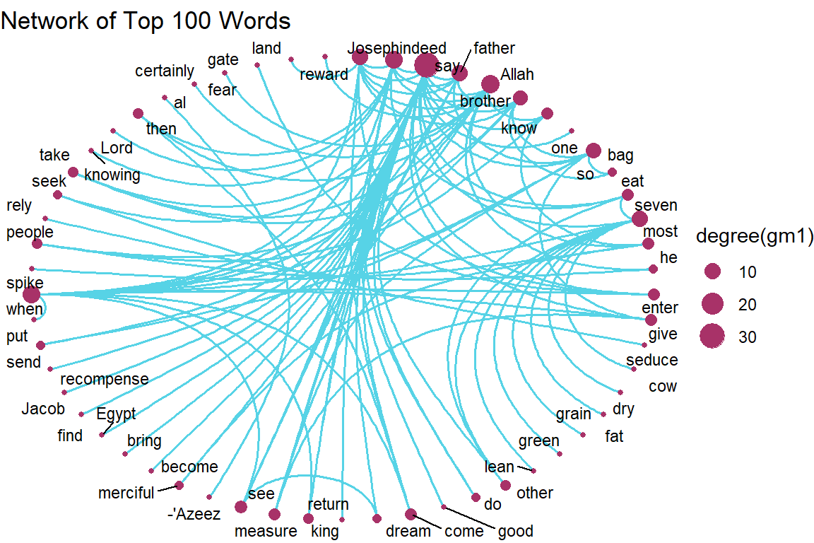
Figure 5.66: Word network with circular layout
Plot output is in Figure 5.66.
5.4.1 Working with a bigger graph
We increase the word network for Surah Yusuf to 2000 co-occurrences or edges.
wordnetwork <- head(cooccur, 2000)
jg <- graph_from_data_frame(wordnetwork)

ggraph(jg, layout = 'kk') +
      geom_edge_density(aes(fill = cooc)) +
      geom_edge_link(alpha = 0.7, color = "#57d3e6") +
      geom_node_point(aes(size = igraph::degree(jg)),
                      colour = "#a83268", show.legend = FALSE) +
      ggtitle("Data Art of Top 2000 Coccurrences")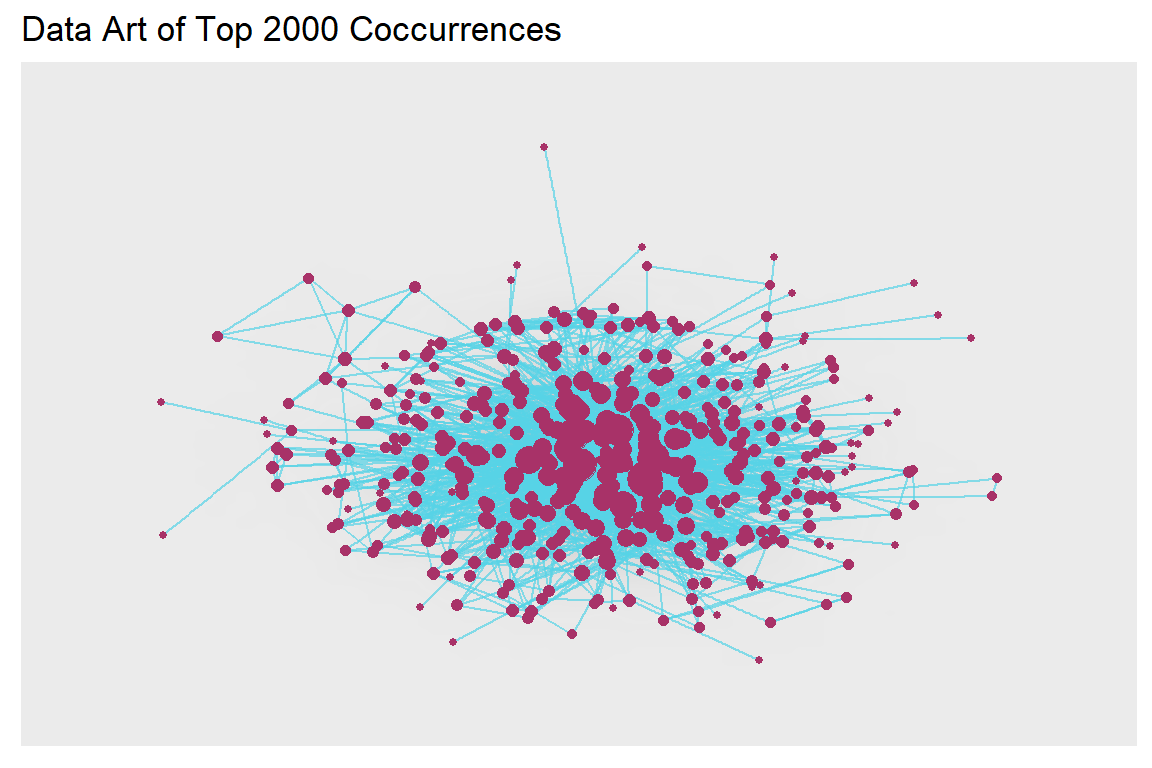
Figure 5.67: Larger word network with kk layout and edge density
Plot output is in Figure 5.67.
Does the plot above show all the 421 nodes as connected? We can do other analyses.
is.connected(jg) # Is it connected?
no.clusters(jg) # How many components?
table(clusters(jg)$csize) # How big are these?
max(degree(jg, mode="in")) # Vertex degree
max(degree(jg, mode="out"))
max(degree(jg, mode="all"))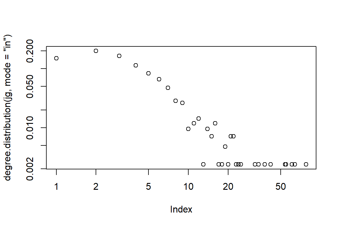
Figure 5.68: Larger word network with kk layout and edge-in density
Plot output is in Figure 5.68.
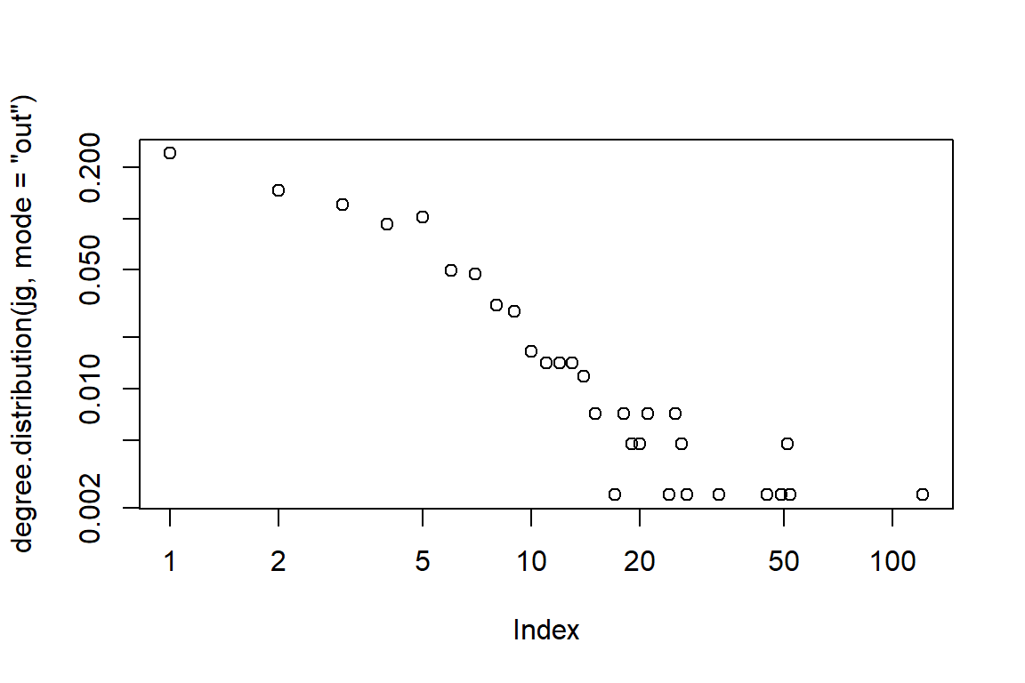
Figure 5.69: Larger word network with kk layout and edge-out density
Plot output is in Figure 5.69.
is.connected(jg) being FALSE says that there are some nodes that are not connected.
lay = create_layout(jg, layout = "fr")
ggraph(lay) +
   geom_edge_link() +
   geom_node_point() +
   geom_node_text(aes(label = name), size = 3)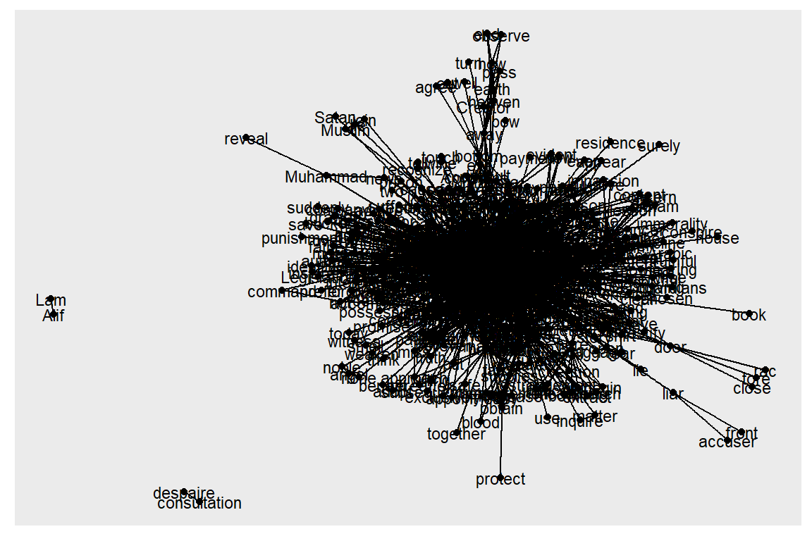
Figure 5.70: One big cluster and unconnected nodes
The rather ugly Figure 5.70 shows the 4 nodes. Let us delete and repeat the cluster analysis. But instead of using the delete_vertices() function like in an earlier example, we just use the main component. First, we find the components and then subset the graph based on those components. In igraph the largest component is not always the first one with id == 1.
5.4.2 Taking the largest component
cl <- clusters(jg)
jg1 <- induced_subgraph(jg, which(cl$membership == which.max(cl$csize)))
summary(jg1)
Another approach is shown below.
5.4.3 Community structure detection
fc <- fastgreedy.community(simplify(as.undirected(jg2)))
plot(jg2, vertex.color=vertex_attr(jg2)$cor,
      vertex.size = 2,
      vertex.label=NA,
      edge.width = NA,
      edge.color = NA,
      layout = layout_with_kk,
      mark.groups = fc,
      mark.border=NA)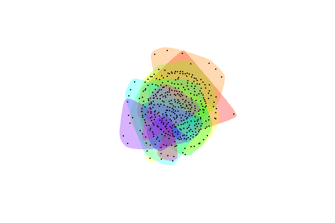
Figure 5.71: Communities within the large fully connected network
Plot output is in Figure 5.71.
The igraph documentation66 lists the following for clusters and communities. Interested readers can explore the different functions following the example above.
- cluster.distribution Connected components of a graph
- cluster_edge_betweenness Community structure detection based on edge betweenness
- cluster_fast_greedy Community structure via greedy optimization of modularity
- cluster_infomap Infomap community finding
- cluster_label_prop Finding communities based on propagating labels
- cluster_leading_eigen Community structure detecting based on the leading eigenvector of the community matrix
- cluster_louvain Finding community structure by multi-level optimization of modularity
- cluster_optimal Optimal community structure
- cluster_spinglass Finding communities in graphs based on statistical meachanics
- cluster_walktrap Community strucure via short random walks
Let us explore cluster_edge_betweenness. We can see a pleasing digital art representing the words in Surah Yusuf.
fc <- cluster_edge_betweenness(simplify(as.undirected(jg2)))
plot(jg2, vertex.color=vertex_attr(jg2)$cor,
      vertex.size = 2,
      vertex.label=NA,
      edge.width = NA,
      edge.color = NA,
      layout = layout_with_kk,
      mark.groups = fc,
      mark.border=NA)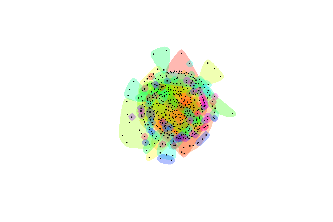
Figure 5.72: Another piece of art from Surah Yusuf
Plot output is in Figure 5.72.
5.5 Summary
Our work on Quran Analytics relies heavily on the use of network graphs. In this chapter, we introduced the tools available in R for creating, plotting, and analyzing network graphs. We have a more complete version of this tutorial.67
We strongly recommend our users experiment with the different parameters and functions from ggraph based on the sample network graphs from Surah Yusuf that we showed how to create in this chapter. It is important to have a working knowledge of network graphs to follow the coming chapters. Network graphs have applications in many other subject matters, so our readers will benefit much from this knowledge.
We will explore the tidygraph package and also some of the numerical analysis on network graphs like measures of centrality, in the next chapter. We have seen in the final example, concepts like “hub” (most central node) and “spread” for our Surah Yusuf word co-occurrence network that is similar to virus networks.
5.6 Further readings
Examples of ggraph :
Examples of network analysis and visualization with R and igraph:
- https://www.kateto.net
- https://kateto.net/networks-r-igraph
- https://kateto.net/network-visualization
R graph gallery:
References
A full-scale work for the Arabic language is beyond the scope of this book and will be left as future research.↩︎
We have not analyzed the performance of the Udpipe model for the Arabic language, hence we cannot ensure its accuracies.↩︎
The data is obtained from running udpipe Arabic padt model on the quran_ar_min dataset from the quRan package.↩︎
This is an important point to be made since we alluded to earlier that removal of stopwords while being practiced frequently in NLP analysis, is non-trivial; and should only be used as a last resort rather than by default.↩︎
Ognyanova, K. (2019) Network visualization with R. Retrieved from www.kateto.net/network-visualization↩︎